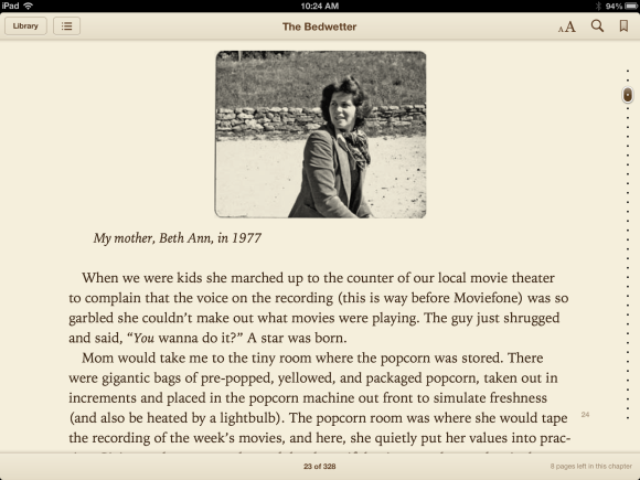
Apple iBooks ...
Okay, I take it all back.

New iBooks, 2012: I have criticised the iBooks app (application) for its retarded concept of what to do with the first chapter in a paragraph. But I take it all back. In a recent review on MacWorld, a contributor (Lex Friedman, Senior Writer, Macworld Follow @lexfri) says:
Other core iBooks features remain unchanged, but still impressive: It offers an excellent selection of crisp, superb fonts; it offers black-on-white, white-on-black, and sepia-toned text/background pairings; it has in-app brightness controls. Its in-book search is quick and accurate. And its support for ragged-right text (as opposed to the Kindle app’s unchangeable, awkward forced justification) is much appreciated.
All of those improvements are useful, and some of them are wonderful: the support for ragged-right text is a huge leap of the imagination, and I'm grateful for it. Apple: thank you!
We should remember that it took half a century after the invention of printing for editors and publishers to realise that it would be a good idea for pages to have numbers, and for books to have a Contents Page. Fifty years! So we can hope that e-books will reach a plateau of perfect utility in fifteen to twenty years' time.
Under the horizon