The age of plastic
The death of typography
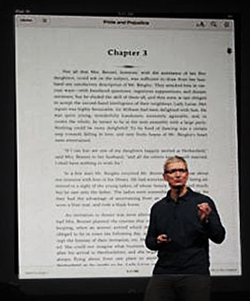
There was a time when the Apple Macintosh computer was known for its graphic design style. Excellent typography was part of the Macintosh mystique, perhaps deriving from Steve Jobs’s time spent in a calligraphy class at college. Well, Steve is gone, and so is the typography. Read this, and weep.
At the recent (23 October 2012) Macworld event in the California Theatre in downtown San Jose, California, we were treated to the release of iBooks, Apple’s software product that allows writers and publishers to create, sell and buy their own e-books. Apple CEO Tim Cook began his iBooks demo with a brief overview on the iBookstore, noting that customers have downloaded more than 400 million books. The iBooks app is ‘one of the most popular apps on the store,’ said Cook, before outlining the enhancements in the new version, iBooks 3.0.
Alas, the engineers who designed the program and the people who designed the presentation of the new version of it share a dirty little secret: they don’t actually read books, or magazines, or newspapers. What do they read? Nothing, it seems. And here’s why…
Look at the shot of the iBook sample page in the photo of the announcement, above, then look at the images below, all scanned from popular books or magazines, beginning in 1702 and ending last week, in 2012. Spot the difference! Over three hundred years of enlightened, tested and proved typographical convention thrown out the door.
Up until now, all books or magazines or newspapers — real texts, printed on paper — have the first paragraph of each chapter ‘flush left’, or ‘full out’, or ‘not indented’. Insert your phrase of choice: they all mean the same. They are never indented for a simple reason: they don’t need to be.
Above them is blank space; lots of it. And often the legend ‘Chapter Three’ or whatever. This opening paragraph is clearly and obviously the start of a new chapter. You don’t need an indent to tell you that this is the start of a new paragraph, as you do for all the following ones. So you set it flush left. The indent is irrelevant, so you don’t need to use it, so you don’t use it. Okay?
As well, it looks somehow ‘neater’ (typographically) if you set the paragraph flush left. It starts the chapter with a neat block of text, like a nice new brick, or a solid new block of wood, that says ‘this is the start of a new chapter’.
Then look again at the ugly example that Apple chooses to showpiece its software. There is a useless and distracting graphic at the top of the text, there is useless extra space added between paragraphs, and the first paragraph is indented. All things that real books never have. But the engineers who designed this awful piece of software clearly don’t read real books, or magazines, or newspapers.
So if you ever intend to submit a typescript of a paper, or a story, or a novel, to anyone to mark, or edit, or publish, please do yourself a favour, and try to look as though you have once upon a time read a real book. Do not indent the first paragraph of each chapter. Set it ‘flush left’, or ‘full out’, or ‘not indented’. Even those cheap novellettes about doctors and nurses designed to pass the time of idle shop assistants (of either sex) use this convention.
It is so easy to do — and your work will look so much more professional. 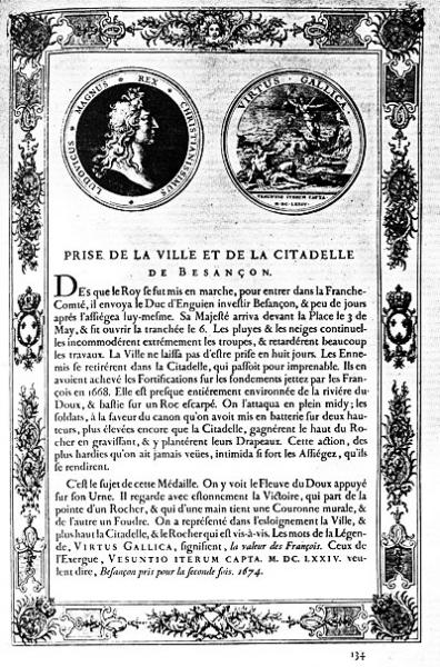
1. Printed book from the Imprimerie Royale, Paris, 1702. Victoria and Albert Museum, London. From James Sutton and Alan Bartram, An Atlas of Typeforms, Wordsworth Editions, Hertfordshire, 1988. 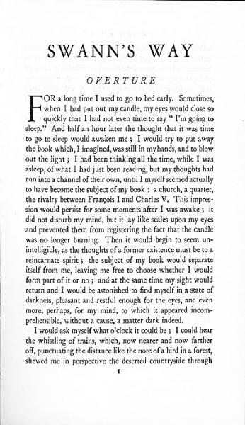
2. Chapter One of Marcel Proust, Swann’s Way (trans. C. K. Scott Moncrieff). London: Chatto and Windus, 1941, reprinted 1969
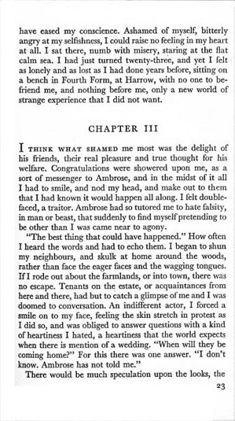
3. Chapter Three of Daphne du Maurier, My Cousin Rachel. Sydney: Angus and Robertson, 1951.
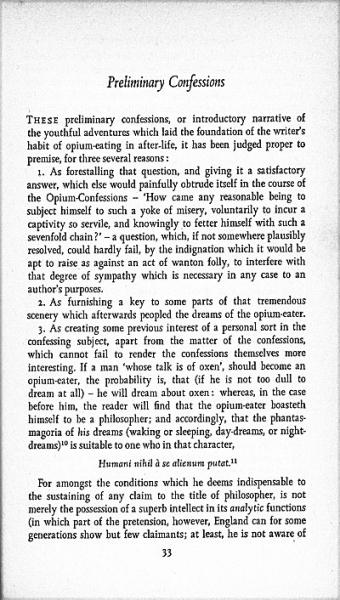
4. ‘Preliminary confessions’, from Thomas de Quincy, Confessions of an English Opium Eater. Penguin: Harmondsworth UK, 1971, reprinted 1979.
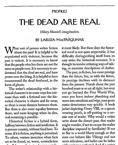
5. From the New Yorker magazine, 15 October 2012, page 46.
Under the horizon