Translation 2.0
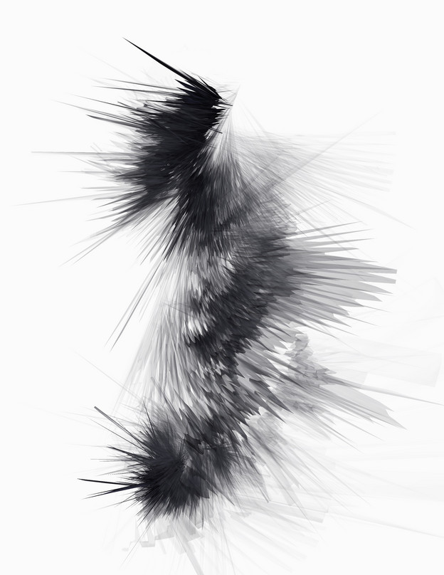
Eric Zboya’s At the Heart of a Shipwreck

1.
Birdlike, a poem lifts off from the page, leaves words behind, ascends beyond ink.
But then it flies into a window.
For a moment: feathers, flight, song and nascent inside-egg become two dimensional as the bird writhes and attempts to rise against the glass.
A birdwreck from the dimensionless air.
And we readers watch, as readers always do, from the other side.
The poem’s inky body has struck the — until then — invisible surface, has written a record of its flight.
2.
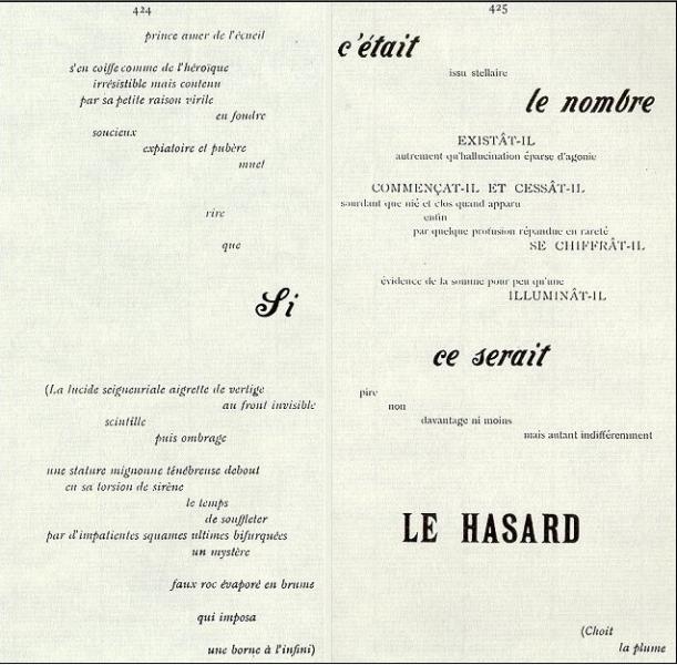
Eric Zboya’s At the Heart of a Shipwreck is a “translation or transformation” of Mallarmé’s typographically inventive poem “Un coup de dés” (A throw of the dice.)
Translation is the thing with feathers. A hummingbird ascending a staircase of air. The Icarus-like energy of language as it struggles against the bright sun of the page. The filigree of water as angels cannonball into the sea. Breath ascending from the heart of a shipwreck to the surface of the page.
How are the words, the lines, the meaning of the original Mallarmé turned into the no-longer French flaps of these beating inkwing traces?
Examing Zboya’s work closely, it becomes apparent that these marks aren’t the creative writhing of an actual winged creature, but instead, a constructed text. From the inky heart of the image to its delicate translucent fluttering, its calligraphic brushing, Zboya explores the poetry of the made mark. His image is an analogue to the vibrance of Mallarmé’s scattering of text across the pages’ open field, the variety of typefaces, of font size, of word length.
Language writes its own Rorschach test. It is a bird. An explosion. The trace of water in the air. The coming together of two different states of matter. The representation of at least one less dimension than is perceived.
Knowledge, once safely ledged, made illegible, taken flight. “whitened// becalmed// furious// under an inclination/ glides desperately// with wing.” (see Mallarmé)
Zboya’s work was recently included as part of the MCA Denver exhibit, “Postscript: Writing after Conceptual Art” which was also shown at The Power Plant Gallery in Toronto.
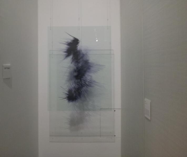
GB: Firstly, I loved how this piece looked at The Power Plant show. I loved how it was on a transparent Plexiglas sheet. An extended page. A three-dimensional two-dimensional object. How you see the extended 'page': the large unbound, two-sided, hanging transparent Plexiglas - as opposed to the small white field of the page?
EZ: Thanks GB. I appreciate your comments, and I am glad you like the work. From the single photo I have seen from The Power Plant exhibit, I believe they may have installed the piece backwards, showing the image back to front instead of front to back. At first I was irritated by this error, but now that I think about it, this “happy little accident” helps to further showcase Mallarmé’s idea that therein lies a higher-dimensional environment beyond the flat and static text that we are always so accustomed to see “face on”—text that feels “trapped” within two-dimensional surfaces. By showcasing the piece back to front, the reader-viewer has the opportunity to see how this image-text exists from the inside of this spatial environment looking out. This is really how I envision the white field of the page - the extended page - as a kind of clear, all-encompassing ether that holds not only volume and density, but something mysterious beyond the scope of human comprehension. We live in a three-dimensional universe (four, if you include time). Text, in the standard sense, I believe, is not meant to be two-dimensional, but three-dimensional, if not higher. Unless text is created as a kind of sculpture, we are pretty much limited to seeing text in two-dimensions due technology’s current capacity. Having the image-text placed inside the glass is really my way of illustrating the idea that the extended page is a gateway into a realm much more interesting than that of two-dimensions.
GB: This is a mathematical transformation/translation of the original. How does the final image relate to the original?
EZ: At the Heart of a Shipwreck is a direct computer-generated translation, or transformation, of the second recto/verso page from Mallarmé’s original text. Since the crux of Mallarmé’s poem centers on a shipwreck (to which the second recto/verso page refers), a shipwreck in which the text of the poem comes to represent the ship’s debris floating about in a kind of ordered chaos, the image-text offers the reader-viewer a kind of hydrodynamic depiction of what the waves generated by a sinking ship might look like. I translated/transformed this recto/verso page many times while simultaneously experimenting with the computer program I use (Photoshop) to create these kinds of images. With the aid of this program, I eventually manufactured the image-text you now see (it could very well be the opposite in that the computer program manufactured the image with my assistance). Now, was it “chance” the program spit out an image that just so happens to look aesthetically hydrodynamic? Mallarmé, and of course, Borges, would say no.

GB: I know the original Mallarmé explores the visual space of the page -- "the raging/whitened /stalled" page, using typography and textual positioning as part of its visual rhetoric. How do you see your work as relating to this aspect of Mallarme? (I see the rhythmic energy, the visual vitality, the energizing of the rectangular space as relating to both works.)
EZ: Ideally, I wanted to display the work by suspending the piece in the center of a room. Or, by suspending the piece in such a way that would allow for the reader-viewer to walk around it at 360 degrees so that he or she could gaze up the image-text at all angles, very much like a three dimensional object. I wanted to give the reader-viewer the impression that they are very much in the same spatial environment as the image-text itself... To help give the impression of dimensionality and an environment beyond the flat surface of the page. This is what Mallarmé was trying to get at with his typographical play—that a vastitude exists beyond the confines of the two-dimensional space of the page. This is a way that one might connect both works together - through the idea of textual spatiality (or, perhaps spatial textuality).
GB: Your work is clearly 'ink'—the same kind of ink that one prints poems in/with. But there's a kinetic aspect to it. The image seems the result of a kind of impact (a 'splat'? a bird against the window? language colliding with the page, with the mind?) How do you see it relating to printing, to publishing, to typography?
EZ: And so here comes an interesting point, GB. The work, yes, is in ink… But unless I have computer monitors set up displaying the image, ink is really the only way I can show the image-text to the reader-viewer. You see, the image-text you see, whether on page or within glass borders, is, in fact, a three-dimensional object trapped in two-dimensional space. In the cyberspace continuum, the image-text can actually be rotated at all possible angles. The image-text possesses length, height, width, and density. The image-text has a front, a back, a top, a bottom, sides, and guts. The image-text is geometric, it is a Euclidean object. And as I have just mentioned, the only way to showcase the design, for now, has to be through ink.
At the time I created the image, three-dimensional printing was really still an idea. Today, only a few years later, there has been mind-blowing advancements in this printing technology. Give it a few more years and I believe that this technology will be capable of “sculpting” this image-text (and others like it).
This notion falls back to the idea that, since we live in a three-dimensional existence, text really should be represented three-dimensionally. It is a shame that we lose one spatial dimension when we write or print text. I think that once science further develops holography, which many physicists are currently investing a lot of time in, printing will become a retro-like function. To accommodate this transformation, publishing will become an industry that will be just as much mathematical as it will be literary.
In the end, I thing the image-text can most definitely illustrate the notion of collision. The collision between two different languages (the written [French] and the mathematical). A collision between old world poetics and new world poetics. A collision between old school poetic processes and new school poetic processes.
GB: Do you see a difference in the work when it appears on a transparent sheet of Plexiglas, as it did in The Power Plant Postscript exhibition?

EZ: Yes, I do see this work differently within this medium. In glass, the reader-viewer has the opportunity to “see through” the work, and “see beyond” the work, which helps to illustrate the idea that something “dimensional” is taking place.
GB: How do you conceive of 'reading' this work?
EZ: Depending on what lens I might choose to use, I could potentially read this work in three different ways:
a) As a reader-viewer with no point of reference
b) As a reader-viewer with a limited point of reference (in that the image-text is just a computer-generated translation of a text)
c) As a reader-viewer who knows Mallarmé’s work, and who has a literary and critical Mallarméan arsenal behind them
As a reader-viewer who has no point of reference, the image-text might illustrate nothing more than an aesthetically “interesting” piece of visual art - a piece of “art” that may or may not have anything to do with the name the piece goes by: At the Heart of a Shipwreck. I have had many people tell me (folks who have no background knowledge of Mallarmé) how much they are captivated by the image’s “wing-like” appearance. These viewers seem to “read” the work as something possibly more biological, or perhaps even spiritual or religious, despite the work’s name, which does not suggest anything biological or ethereal.
With a viewer-reader who has a limited point of reference in that the work illustrates a computer-generated translation of “some” text, I might read the work only as a transformational process by a machine. I think reading this work only as a process is pretty cool . . . machines translating a language via their own. This idea helps give some weight to the idea that mathematics is also a kind of text-based language, one that I hope to explore further, both critically and theoretically.
As a viewer-reader who possesses the contextual and theoretical arsenal behind them, I would read the work not only as a visual response to Mallarmé’s original text, but as a critical response to those poet-artists who have offered their own unique and wonderful translation of Un Coup, such as Broodthaers, Pichler, Maranda, and Mollinari, to name a few.
GB: How would you relate this to the tradition of poetry generally and visual poetry specifically?
EZ: As a computer-generated translation of a literary work (or a visual transformation through the language of mathematics), I really see this image-text (image-text as process) as a kind of evolutionary step in poetic creation and experimentation, both in the traditional sense and in the visual sense.

Poets should start experimenting more when it comes to the poetic process. I think it is time for poets to start thinking outside the box because we just might end up reinventing the poetic wheel (look at Kenny Goldsmith’s Uncreative Writing and Christian Bök’s Xenotext Project). The tradition of poetry is based on experimentation and exploration. Without experimentation, we would not have the variety of forms we have today.
GB: What would a 'close reading' of this work look like?
EZ: Asking this question could yield a multiple page answer, GB. But I will try to condense the answer the best I can.
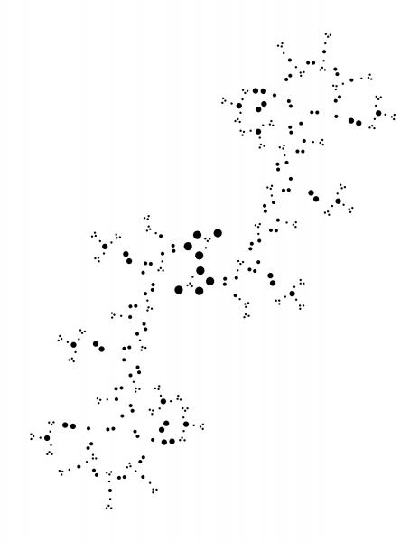
A close reading of the image-text, at least for me, would yield a direct response to experimental artist Michael Pichler’s rendition Un Coup de dés Jamais n’Abolira Le Hasard (Sculpture) while simultaneously analyzing Mallarmé’s original text.
Mallarmé’s original text, as theorist Maurice Blanchot maintains, acts as a poetic gateway into an environment beyond the two-dimensional page. Within this environment, textual structures create textual constellations that have the ability to transcend margins, change shapes, and exist in a continuum of infinite possibility.
Pichler’s lovely rendition employs the use of lasers to excise these textual structures to expose these higher-dimensional characteristics of Mallarmé’s poem (a very cool process). This erasure, however, removes the topographical significance of the typography within the framework of the poem. At the Heart of a Shipwreck exemplifies a kind of dynamic, spatial equivalence that reproduces the higher-dimensional kernels of meaning found within Mallarmé’s text while transporting the structural lattice of meaning into a higher, planar ascension without the technique of erasure. Within the design, the text remains … it has just transformed. In the end, Pichler’s rendition, along with my own, does help to illustrate the idea of textual transcendence (which, now that I think about it, the image-text’s “wing-like” appearance, as mentioned a couple of paragraphs above can somewhat convey this idea).
GB: Many of us come to the original Mallarme in English translation. Your work is a translation. Can you speak about your extended notion of translation—a translation which means translating a text right out of textual language itself.
EZ: The image illustrates a process of translation through the language of computers. I think that we tend to overlook the fact that mathematics (which really is a system of representation and communications based on semantics) is, in fact, a language; and it is a language that has been ignored and forgotten about as a potential vehicle for translation. (It is interesting to note that the prototypical definition of translation is the translation of one language to another. With Shipwreck, the final product is, in fact, not a language, but rather the visual end result of pixel reconstruction based on mathematical computations. I guess, in this sense, translation comes to mean the conversion, or transcendence, of one medium to another). This is my sole aim - to illustrate the idea that “any form of language” can and should be used and experimented with in the act of creating and in the act of translating. Translation should not simply involve French to English or English to Chinese. It is time we broaden our minds, and our poetic processes and practices, into something more 2.0.
GB: The original Un coup de dés (a throw of the dice) seems to refer to chance operations. In other words, a kind of mathematical process. How does your computer mediated mathematical process relate to this?
On the surface, Un Coup does suggest the idea of chance operations; however, if you delve deeper, the poem actually implies deterministic operations. Like Borges, Mallarmé believes that the poet-artist merely acts as a textual excavator, one who merely uncovers and brings to the surface an already pre-existing text. Chance cannot enter a text, and chance cannot create a text that already pre-exists somewhere beyond the white space of the page. In this sense, the computer-generated image-text that is At the Heart of a Shipwreck, too, would follow the notion of textual pre-existence. All I did, with the aid of a computer and a computer program, was brush away the other computer-generated variations in order to find the right visual.
Eric Zboya is an experimental poet and visual artist who lives and works in Calgary, AB. Eric's works have appeared in a wide variety of literary journals, magazines, anthologies, art galleries, and museums throughout North America and Europe. He was a finalist for the 2013 Robert Kroetsch Award for Innovative Poetry and the 2013 Alberta Magazines Showcase Awards selection of poetry.
The complete Mallarmé MS with extensive discussion by Zboya
Four visual poems
derek beaulieu writes about Zboya on the MCA Denver blog.