derek beaulieu's 'Prose of the Trans-Canada'
A 1:1 scale road map of language

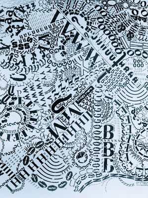
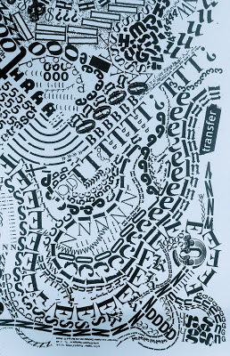
derek beaulieu’s Prose of the Trans-Canada is an epic inscribed scroll, a graphemic saga as Odyssean and graphic a roadtrip as traveling the eponymous Trans-Canada highway. The 16” x 52” work is named after Blaise Cendrars’ monumental Prose of the Trans-Siberian (1913), a milestone in the history of artists books and visual poetry.
beaulieu writes that naming it after Cendrars' work, “places it within a continuity of engagements with the artist's book (as Cendrars' volume is considered an early progenitor of that form). Cendrars’ Prose of the Trans-Siberian was also a reply to the architecture of modernism: if 150 copies of Cendrars’ volume were placed end-to-end, the result would be the same length as the height of that symbol of Parisian Modernity, the Eiffel Tower. If 150 copies of my work are placed end-to-end, it will be same length as the height of that symbol of Canadian modernity, the Calgary Tower, hardly as monumental.”

beaulieu’s Prose of the Trans-Canada pulses with the Brownian motion of language. An entomological ‘teaming’. Clouds billowing from an alchemical retort. A Mercator projection of the cerebral cortex–like folds of writing. A cloud-town view of the not-flatland of the alphabet freed from the governance of the invisible hand. A Borgesian one-to-one scale map of language. A CAT-scan or phonological EEG of the submorphemic structures of writing. A glyphic Bayeux tapestry, a pre- or post-codex scrolling trafficking in the prose tattoos of a trans -cribed, -gressed, -ferred, -(Cendrars)ent Canadian coast-to-coast (litoral to literal) journey.
Because it was created out of Lettraset (dry-transfer lettering), the work seems a performance of the mark. The hand/mind/written mark in concert. A letter set. There is a rubbing. There is ‘a’ rubbing. The trace of the marks’ creation and the writer’s writing. And, since it is Lettraset, we are reminded that every mark comes from a pre-existing repertoire (indeed there can be observed, close-up, elements of metadata from the Lettraset sheets: the company name, its copyright notices.) A letter hord. Hoard. Horde. Each letter from a particular time and place. A trace. And the page records. It is a locus of the moment of phenomenological realization as a material mark on the page. And because with Lettraset there is no erasing or revising, it is all ‘real time.’)
The repeating letters, broken free from the up/down Cartesian grid of normative print are instead a rivering of letters riven from a long wail of potential, either given a context or recontextualised. We’re reminded of the writer’s ‘making’ (even in these ‘borrowed’ letters ‘transferred’ from somewhere else) because of the Baroque and virtuoso panoply of letters. The use of all the existing space is Baroque or abstract expressionist in its detailing.

I recently wrote to beaulieu via email (and our discussion was carried by the regular distribution of letterforms arrayed in a regular order, though displayed before us on a luminous screen.)
How do you conceive of ‘reading’ this work as a text?
Reading visual poetry is a challenge only if we rely solely on the skills we apply in traditional literary reading. The reading techniques necessary in graphic novels and comic books (unexpected juxtaposition, gaps in linearity, chronology jumps inherent in the gutters and margins between panels, etc), in graphic design (the jarring use and combination of letters and symbols in advertising slogans and logos) and resonant repetition (cf. Gertrude Stein) all can inform how we can approach visual poetry at its best.
Could you comment on how you might imagine a 'reader' as approaching the text?
Approach Prose of the Trans-Canada as you would approach the overwhelming advertising in the streets of Tokyo or Times Square; the way you read the multidirectional cubism of the daily newspaper or the way you read the internet. I aim to create moments of lyric sensitivity within the juxtaposition of serifs and ascenders within the field-covering mass.
Is there such a thing as a visual metaphor and how might it operate in this context?
Every corporate logo is a visual metaphor for consumerism and the highly-crafted emotional responses solicited by the designer; poets need to learn the same skills.
[beaulieu expands on this in an interview elsewhere: “Like logos for the corporate sponsors of Jorge Luis Borges’ library, my concrete poems use the particles of language to represent and promote goods and corporations just out of reach. These imaginary businesses, and the advertising campaigns that support them, promote a poetic dreamscape of alphabetic ostranenie.”]
How might you imagine the reading process to unfold?
The same way we read everything except the literary [to quote bpNichol]:
every(all at(toge(forever)ther) once)thing
* * *
And, in truth, perhaps what derek beaulieu says is true of all reading: if it's not every(all at(toge(forever)ther) once)thing, it's an other.
If you'd like to read more about Prose of the Trans-Canada, I'd recommend the marvelous close reading by the poet and critic Geof Huth, which can be found at his blog. The images that appear in this post have been reproduced from there through his kind permission.
derek beaulieu is a Canadian writer, critic, and publisher. In 2013 Wilfrid Laurier University Press published Please, no more poetry: the poetry of derek beaulieu as edited by Kit Dobson. beaulieu teaches at Mount Royal University and the Alberta College of Art + Design. More about him can be found at his website.