
The Re(a)d Yarn
Narrative in the visual poetry of Satu Kaikkonen
Satu Kaikkonen is a prolific and protean poet from Finland. She writes that “I'm a storymaker and this is seen in the narrative aspects of my vispos. Each series is like [one] continuing poem and the individual vispos are its verses.”
In this commentary, I’d like to focus on two ‘verses’ from her Grey and Yellow Series: “Sisters” and “A Grandmother.”
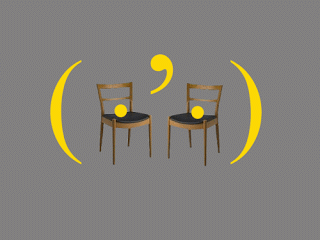
The images are two vignettes or mises-en-scène. Chekovian tableaux in abstract space. A subdued grey background. A chair or two. One chair remains in the identical place. One is added or removed. Each image represents the same abstracted room-space. A poem–or verse of a poem–is a scene. A stage.
Each of these poems represents a sense of interpersonal relations as well as aspects of recalled personality. Bright yolk-yellow glyphs occur as elements within the scene but also serve as relational or framing devices. The images convey a pervasive mood or emotion. The sense of potential interaction: past or future. The images are both the schematics for dramatic scenes and hieroglyphic representations. Monochromatic glyphs and the photographic representation of simple objects on the same plain plane.
"Sisters" (above): Is this the portrait of two sisters, two sisters gathered together by parentheses as if in a locket, or in a single round room, each sister represented by the dot–each egg-like period sitting on a chair as if in conversation. Do these two dots belong to a set of three ellipses? Are the dots the actual sisters or do they stand in for the missing people? Is the notion of sisters metaphorical or is literal sisterhood being represented? The two ‘sisters’ are gathered together by the embrace of the parenthesis. They form part of a set. They fall within, are intimate or held together, bounded. Sisters within the same parenthetical womb.
And the comma? Is it an apostrophe: a possessive: “I’m”? Or does it represent a contraction, something missing or unsaid, unspoken: “Can’t”? Are the two items part of a list, two clauses? Whatever is happening, it’s relational. The two ‘sisters’ contextualize it. It is understood, unsaid, missing, elided, actively connective.
What is happening here? What story or interpersonal song is unfolding between the sisters? Is this before or after the important events? What happened/will happen/is happening?
And now, like playing a Tarot card in Calvino’s The Castle of Crossed Destinies, we move to the next scenario, the next stanza. It is not specified which image is next. Any card may be played.
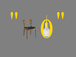
"A Grandmother": There is only one chair. Is this the eponymous grandmother? The chair is empty. Perhaps she is gone. This was her chair when she was alive. A bare lightbulb hangs balefully, not providing any light. It is surrounded by an O. An antique window? An old fashioned oval portrait of the Grandmother? A locket? A reminder of the past, of memory, of ancestors? Indeed, the entire scene appears within quotations. (Plain and homely quotation marks not ‘curly quotes’; exclamation marks without the exclamations.) Is the scene a quotation? A memory of the Grandmother, or something the Grandmother said? Does the Grandmother quote old sayings? Are the sisters reminded of this? Is the Grandmother one of the sisters and she thinks of the other sister(s)?” There is something lonely about this poem, the plaintive arrangement of visual elements: the grey, the barelight bulb, the empty chair. The matter-of-fact quotation marks–compare it to the zaftig apostrophe which hangs between the sisters.). Is there regret here? There is no warm world-like, womb-like embrace of parenthesis and their nourishing crescents of golden-yellow.
Here are two frames from a graphic novel, two words from an abstract rebus. Two movements from a musical suite. We might understand something of the mood, of a kind of interaction, of the interplay of form but we are left to draw our own conclusions. The striking elements are presented to us, but, as Viriginia Woolf writes of Chekov, “We need a very daring and alert sense of literature to make us hear the tune, and in particular those last notes which complete the harmony.”
A conversation with Satu Kaikkonen
GB: You are a very prolific visual poet. You explore many different styles and techniques. One thing which is constant throughout most of your work is that you often create series which are variations on particular elements, for instance, glyphs, colours, techniques, or visual tropes.
SK: I usually do my vispos and asemics in series because I like to explore how the picture changes bit by bit, and how the meaning in it changes, but the main reason is that I'm a storymaker and this is seen in the narrative aspects of my vispos. Each series is like a continuing poem and the individual vispos are its verses.
I do two different kind of series: sometimes I use the same ”main background idea” (for example, the relationships between relatives like in the Grey and Yellow Series) and the vispos in the series are in same colors and they include some same elements, but every vispo is its own story. I make series that are from the same picture and I just change a little bit of something in it, so that the story continues.
GB: You use a mix of physical objects with texts. Sometimes fragments of paper, music scores, text (usually in Finnish) or photographs of objects.
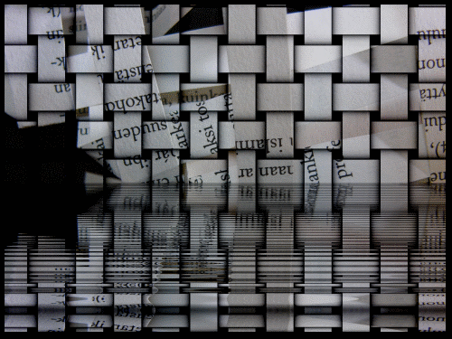
SK: Although I usually work on the computer and my works are made mainly by the computer, I use music notes or concrete things like feathers, needles, shredded papers from the old books that I buy from the library's take-away shelf and all that kind of thing. And I often ”sew” or do ”crafty” things from the papers of the old books and then my husband and I photograph them and then I work with the photos and make the finished vispos with the computer. For example, "Paper Boats" ("paperiveneitä," see above) from the year 2009 is made like this.
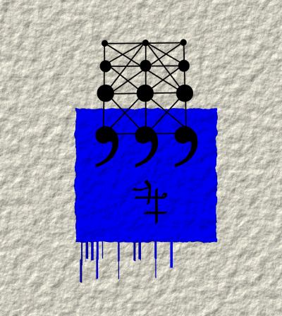
GB: Colour is a significant aspect of your work. You create vivid images, often with an almost iconic use of colour, colours which seem very palpably present.
SK: I like to use strong basic colors at my works grey, yellow, black and red because they are visually arresting colors. I think that using only a few colors is better than using the entire palette.
GB: Many of your pieces have dedications and/or emotional content. And I don't know if you want to, or are comfortable to talk about this, but your articulation of grief, tragedy, and memory is profound. This in contrast to the delight, joy and sheer pleasure in invention and creation that is found in some other of your pieces.
SK: I'm a very intuitive and a sensitive person, and I think that you can see it from my vispos, because some of them which carry concrete memories of the events of my life. I think that my friendship with [poet and artist] Troylloyd and his disappearance has had a very large impact on me. And of course the death of my son. I'm just that kind of person–the memories and events just come to my vispos in a very intuitive way from my subconscious: I start to do something and then I notice that it became just something else other than what I first thought, because of that intuitive element of my mind.
GB: You often also explore single letters in your “letter poems,” and play with a certain repertoire of signs: large letters, a framework of polygons, icons such as pointing gloved hands, red yarn, punctuation.
SB: The letter vispoem are very important to me because through them I have tried to study those basic meaning that are hidden in the simple marks. If I change a little detail, the whole meaning changes and that's kind of fascinating thing. I think that I want to explore all different kinds of artistic and typographical terrain. I think that as a visual poet I'm a explorer of the language.
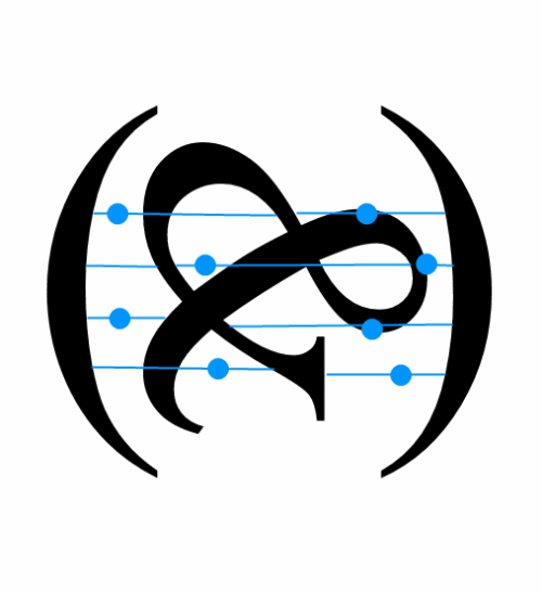
GB: I’d like to discuss reading your letter vispoem, "The Earth." To me, the parentheses form a planetary shape. The blue reminds us of the water of earth. The horizontal lines seem musical: the strings of a instrument or a musical staff, the blue dots like notes, or indications on a string instrument’s tablature. The ampersand? Currents of air or water, or representing the conjunction of life on earth. And the play of the curls of the ampersand with the blue dots and the straightness of the lines: a kind of visual analogue to rhythm. The whole thing seems like a music of the spheres with the entire image recalling a kind of zither/or ancient lyre. How do you see this?
SK: "The Earth" is a response to Stephen Nelson visual poem "Then & Now & Always." The parentheses are the Earth, they make the shape of our planet. And the things in it are we humans, and clean water and air (those most important elements which make our planet a place where we are able to live.) The blue color and the spots refer to that, and the ampersand represents the humans and the idea that we can not do things alone, we can only do things only together. That’s why the ampersand is in that position: we have failed, but not yet for ever. We have not finally failed, we will be able to make a change if we learn to do things right. The blue lines with the spots also make a musical staff with notes: the human voice, our existence, depends on how ”the nature makes its music,” how it breathes... something like that.
Satu Kaikkonen (23.8.1967) is a comprehensive school teacher, a poet and visual poet from Finland. Her works include traditional lyrics as well as visual & asemic poetry and sound poetry. She has taken part in exhibitions of visual poetry in the US, UK, Hungary, Russia and Finland, and her works have been featured in numerous poetry magazines, both Finnish and international. My works are also included in The Last Vispo Anthology 1998-2008. She has a vibrant and extensive online presence. Her visual poetry website is a good place to start.