Sensory type/topographies
Ken Irby's atlas to the world
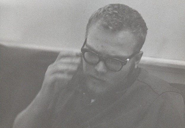
Poetry icon Kenneth Irby creates texts of sensory topographies — and so he has changed technology of the page. I remember his long-time publisher John Moritz of Tansy Press fussing about Irby’s long lines and the gap-toothed spacings and typography and original illustrations — all the ways Irby pushed the limitations of ink, paper, and bindings. This was decades ago, and I still see John grumbling as he midwived some of the most remarkable writing of our time. Irby’s collected poems, The Intent On (from North Atlantic Press), covers forty-four years, 1962 to 2006. The squarish, dense tome is blocky and weighty until opened. Then dynamic axes of typography rise from inert materials to create a map at least the size of the known world.
Irby is particular about the way his verse looks on the page, how it sounds in the ear, and what stories refire with his calibrated vocabularies. Because the printed page is stationary, it changes context as time moves around it. When performed, many variables arise; whether silent or performed, no reading is the same river of words. Irby exploits the paradox of composed verse, its simultaneous dynamism and stasis. George Butterick uses the term “interwoven incremental associations” to describe Irby’s in-motion structures.[1] Words do not suspend in coequal solutions; rather, they impel engagement. They locate readers in geographies of real and confabulated places. Pierre Joris identifies the twinning of real and imagined territory in Irby’s work as “congruence between that dizzyingly wide open outside SPACE (as Olson spelled it) and a just as wide and even more unexplored (at least by me) post-Rimbaldian, post-Artaudian inner space.”[2] Irby himself describes the design of one of his long poems (“Kansas–New Mexico”) as “spokes of a wheel, the center, hub, of which is never given, only implied.”[3] A brief selection of “spokes” in an Irby piece are: storytelling; the body itself as an extended geography; allusions to writers and artists; etymologies; letters/glyphs/images; and complex page layouts. His pages are strata of artifacts arranged in spatial suspension. Space, lettering, punctuation, glyphs and layout all contribute to Irby’s unique imprints.
Excerpting Irby’s poems is particularly difficult because of the resulting truncation of broad arcs. Nonetheless, here is a later swatch of “To Max Douglas”:
The survey baseline of Northern California
anchors on Mt Diablo
the survey spread of the hand
held out, the nakwach
half, leans on the line on through the eyes
what all trace you make
moving through one whole day
there is an equivalence of hair
for all those weeks Jed Smith
tracked North along the Sacramento River (199)[4]
All these pathways lead back to the human body — “spread of the hand,” “the eyes,” and “hair.” Jedediah Smith, another throughline of the long poem, is the first settler American to travel up the Pacific coast to Oregon, and here the journey of his body across the map traces a trail, a nautical “tack.” The orientation of surveyed land overlays the geologic — two sliding rockbeds that form, in Irby’s large view, “the hand / held out” (the body as landscape, again) and the Hopi “nakwach” image. This indigenous image represents two men shaking hands (from a dance gesture); it can be abstracted in designs as overlapping curves or interlocking, angular curves.

In parallel to this glyph, Mount Diablo lies at the convergence of upthrust and slipthrust fault lines. Its peaks appear as a double pyramid from most Bay-Area viewpoints. Irby suggests all these aspects in one polysemic image. So Irby evokes spatial experience with images and references. This content dictates the form.
I posit that no piece of Irby’s opus does not reference a place, and most directly, as the titles iterate: “Kansas–New Mexico,” “The Grasslands of North America” and “the headland of lesser Asia.” Irby is an omnivore of place, from humble to grand: yards (“The roadrunner that crossed my yard,” [5]); sewers (“Moss in the gratings / of a sewer vent,” [97]); famous mountains (“West in the mist / Tamalpais’ top floated,” [257]); sidewalks (“the sidewalks are all dried out after the rain,” [570]); and parking lots (my favorite: “I had talked to Denise Low in Alvin’s parking lot that evening,” [577]). Indeed, his places include the sweep of continent:
The eye
circles, and seeks
in the long map of California
a rest
along the Central Valley
looks down
keeping the corners out
open toward New Mexico
and the High Plains North, old
watersheds East and back again
of the spirit journey
looking for home. (270)
The “spirit journey / looking for home” is Odysseus, is Irby, is each of us traveling through cosmic sequence. This as-the-crow-flies view encompasses the American continent west to east, culminating in the imaginative place of “home.” Space is the first principle of home. These places are the primary glyphs on the page, implied if not drawn: cardinal directions.
Charles Olson writes further geography as meta-image. Physical expanses challenge Americans, who must contemplate journeys even if they remain static:
I take SPACE to be the central fact to man born in America, from Folsom cave to now. I spell it large because it comes large here. Large, and without mercy. It is geography at bottom, a hell of wide land from the beginning. … Some men ride on such space, others have to fasten themselves like a tent stake to survive. As I see it Poe dug in and Melville mounted.[5]
Irby is both a rider and a staked man, according to critic John Latta, “[a]nd Irby, one thinks, in a sod house, dug in and mount’d, traversing (“uncertain wandering”) the oceanic prairie.”[6] Static and dynamic, fixed and mutable. These are continuous and contradictory motions in Irby’s prosody. For Irby, geography is ever present, as part of his sedimentation. His lines are physical objects, as Mike McDonough describes:
As Irby’s lines pile into strata, seemingly geologic forces fracture the layers and puncture the boundaries between dream, myth, and reality. Fossilized particulars are pushed in by the waves and stranded by the outgoing tide like trash on the beaches of our attention, opening surprising vistas into “that endlessness of everyday / this is precisely eternity.”[7]
This attention to strata shapes all of Irby’s works.
No detail of the Irby books is haphazard. The poet selects punctuation marks deliberately, and he selects his own marks, omitting others. In “To Max Douglas,” for example, Irby indicates pauses to readers by using commas. He questions (a question mark appears in “Interstate 80?,” for example), but nowhere in the poem does he stop. He never uses a period, and so constant dynamism occurs in apparently resting landscapes:
Interstate 80? especially the arch
of Nevada
under the arch of the ribcage the redwood seedling sprouts
the year of living in California nurture its garden in the heart
as well as Kansas and New Mexico, all at once, as Freud saw
all the ages of Rome superimposed in one vision
as on the palm, or heart beat
strings across the belly pit of the Basin West (201)
The lines are continuous, unstopped, like the fractal infinity of physicality. Freud’s “superimposed in one vision” of multiple ages is exactly Irby’s point, and the question mark destabilizes the certainty of linear space — the highway. The lack of a final end stop further reopens all meanings. Elsewhere Irby uses brackets, dashes, quotation marks, underlining, hyphens, colons, three small stars in a row, italics for emphasis, and long lines. Lots of brackets, by the way, but no periods, ever, not even for abbreviations. I do not find semicolons, either — the punctuation mark that is a soft period. Irby selects his own signage from the toolbox of type. All marks on an Irby page, however, lead to the most unresolved organic experience, inhabitation of a body, which experiences one final period — in death. At all other times, the body, and mind, are in motion, like Irby’s verse. I have not found a period in any of the verse of The Intent On, excluding prose pieces.
Irby needs more than the Roman alphabet to explain his expansive ideas. In addition to nakwach, he references other Native glyphic traditions in a petroglyph-inspired section of Catalpa. The frontmatter acknowledges sources of images:
Other drawings are by the author, some based upon reproductions of petroglyphs and pictographs found in these works: Campbell Grant, Rock Art of the American Indian (New York, 1967); Peggy Schaafsma, Rock Art in New Mexico (Albuquerque, 1975); Forrest Kirkland and W. W. Newcomb, Jr., The Rock Art of Texas Indians (Austin, 1967). (246)
Most of these are anthropomorphic — stressing again the human form as a reference point.
Irby also uses Chinese characters within his alphabetic texts. A quotation of Lao Tzu is among the opening inscriptions for Call Steps: Plains, Camps, Stations, Consistories, in both characters and English translation (411). The prose section of Catalpa that begins “The students from Cracow leave” includes an Asian glyph — the Chinese character hsin or mind/heart (335). The symbol is drawn with four or sometimes three brushstrokes shown here.

This symbol is one he annotates in the same poem: “February piercing the heart and setting the pericardium afire till it walked, a striding burning hsin, mind/heart, becoming in the stretch of distance and snow, such an eye” (335).
In Irby’s own drawings, which often accompany his inked signatures of books, he often adds his own character, a circled dot with three teardrops below. These resemble the three downward strokes of the hsin, perhaps, but I hesitate to limit any mark by Irby to denotative strictures. The polysemic nature of his images within the poetry extends to these glyphs.
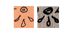
In the original edition of Call Steps, and its reprint in The Intent On, the three teardrops appear after the obituary notice of James Malin:

These accentuate heartfelt grief expressed for the death of the esteemed Plains historian. Irby is innovative in his extension of possible marks on the page. Discussion of glyphs appears in Olson’s Mayan Letters, but that poet does not integrate glyphic figures into his verse.[8]
Irby reaches beyond conventional typography to use, often, a circled star (✪) as a section divider, with subsections divided with small, vertical diamonds: ♦. A few variations occur. In the 1992 edition of Call Steps, the stars are simple asterisks. As early as 1971 and 1974, the circled star ✪ appears in the first two editions of To Max Douglas, and in 2009, it or the diamond consistently replaces asterisks from previous editions in all of The Intent On.[9] If a reader is lucky to have Irby sign a book, Irby embellishes his remarkable commentary with small drawings, almost always with this circled star ✪. Here are three examples from my collection, one from a 1984 typescript poem marginalia (“[exercitation / praecipere]” [636]); “[syzygos],” a 1999 “chaplet” from Arcturus Editions (552); and the other from an envelope from a personal letter dated 2005.[10]

This symbol reappears consistently through the decades. In recent conversation, Irby suggested this symbol references, though is not confined to, Leonardo DaVinci’s Vitruvian man, who has ideal proportions.
The circled dot also is a repeated Irby wingding, added to his signature and to book inscriptions. It is an astrological symbol for the sun and alchemical symbol for gold.
![]()
Rosicrucians say it is a fertilized egg, and/or a focus of spirit in the body. For Irby it changes meanings as contexts change, and I would not reduce it to any one of these cultural allusions. Other symbols used for accent or section divisions are an outlined star (“From Some Etudes,” Tansy 9, 1978)[11]; solid dot (“For the Snow Queen,” Tansy 1, 1976)[12]; and a symbol I cannot describe in the original edition of Orexis,
![]()
replaced by a solid dot in the collected poems. The circle and angular strokes resemble the O and X of the title Orexis, the Greek word for desire. Yin and yang are easy associations. Most interesting of all Irby’s typography is the image from the back cover of Orexis, where Irby’s own image becomes a glyph:

This embeds his own roundish face within the letter O — created by photo-collagist Susan Quasha, from a photograph by Charles Stein.[13] Body and typography merge. Although the poet did not create this glyph, he consented to it, and the image reinforces the theme of body connected to the writing, not the Cartesian separation of mind and body.
So Irby extends the technology of the page to include his own handwritten commentary, journals, and drawings — original or reproduced from the printer’s tray. And so the inscribed page becomes another aspect of the poet’s body. Margins and edges of pages do not limit Irby’s process of conversation. He writes/draws in an open, unified field, where his own life experience is integral.
Irby also uses his own larger drawings as visual commentary in some of the publications, as frontspieces or dividers (pp. 92, 144, 155, 562, for example). The drawings are intrinsic to the book composition. They modify the printed object in terms of Irby’s own invented syntax. The page is the place where the reader’s body touches the collection of thoughts sent through time from Kenneth Irby. Another example of his artwork is on the back cover of The Intent On, an abstracted, full-color drawing of hills, dated “7 April 00,” from his journals.
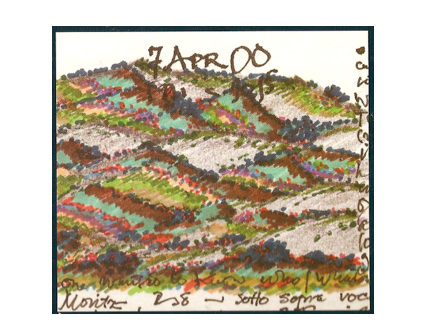
Some years ago Irby showed me one of his journals, and I marveled at the drawings peppered through the text. I recall he said that he made a drawing each day, if at all possible. Output from his hands, alphabetic or illustrative, contributes to one continuous drawing, which is his life work. Each Irby page has its own intrinsic composition, and this handwritten inscription shows one mode:
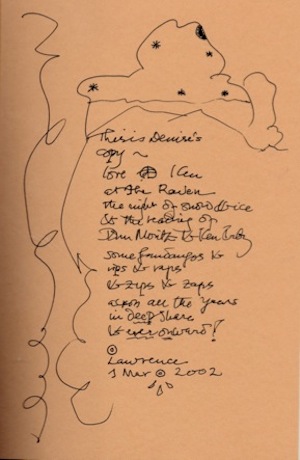
This is the front endpaper to my copy of Ridge to Ridge, and the open page seems designed for inscription: “This is Denise’s copy / love ✪ Ken / at the Raven / the night of snow & ice / & the reading of / John Moritz & Ken Irby / some fandangos & / rips & raps / & zips & zaps / all the years / in deep share / & ever onward! / [circled dot] / Lawrence / 1 Mar [circled dot over three teardrops] 2002.”[14] The volume is not complete without an individualized inscription. Irby reaches as an individual to each individual reader.
Here is an example of the layout designed with a space for the author to be completed with inked inscription:
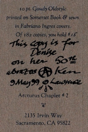
Each Irby page, whether printed or handwritten, has its own composition, specific to the day and place — a more Mayan sense of time being a sequence of unique bundles rather than repeated days. Olson, speaking of Mayan thought, wrote: “Time, in their minds, was mass & weight.”[15] If there were hours enough, I suspect he would hand-draw each copy of each book.
When limited mostly to the Roman alphabet and selected punctuation, Irby uses a painter’s sense of composition. Here is the centerfold of “From Some Etudes,” set by Moritz for Tansy Press in 1978:
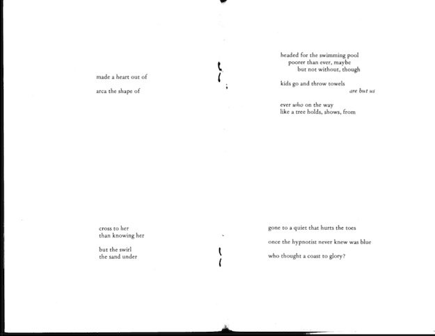
The words gain interrelationship, emphasis, reframing, and depth from not just the white space but also the four-pointed arrangement on the page. The stanzas weight the corners and so accentuate the dimension of a page. This creates an abstracted, symmetrical presentation of alphabetic language. This could be a John Cage musical score or a diagram or a map. Layout of Irby’s work is a topic for longer discussion than this commentary.
Etymology is another axis of Irby’s work. I read his writings as a young woman, and from them I learned respect for other language systems. Stranded at the very center of the continent during the twentieth century, in Kansas, this was no minor awakening. I acquired a smattering of Latin, French, and Greek from college, and these helped me to excavate layers of Irbydom. Etymologies resonate obliquely or as direct hits. They often affect the layout, as in “In Place of a Preface” (Catalpa), which is an extended definition of “Land,” “Scape,” “Landscape,” “Plant,” and “Place” (249–52). Indeed, these specific word histories resonate throughout the book Catalpa. The arrangement of this piece shows the dictionary-like composition of the lines:
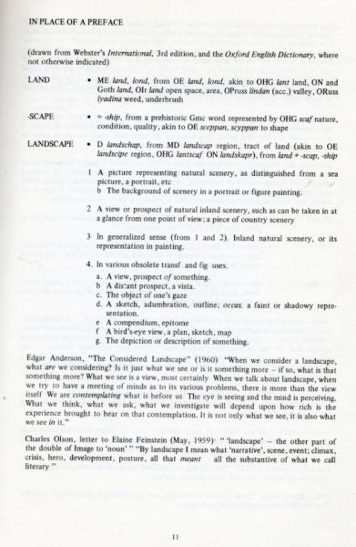
The layout is recognizable immediately as “definition,” a visual cue as identifiable as a phone book or the Bible. The poet selects from the Oxford English Dictionary and other sources, processing them into his own typographic formations. Greek, Latin, Spanish, and many other languages appear in the opus.
The catalogue of Irby’s places, people, flora, and fauna is exhaustive. I have come to visualize his chosen writers as points on a parallel-dimension directory, the great multidimensional structure of time and place that preserves writers’ birthplaces and birth dates. Those who know Irby know his celebration of birthdays of every great personage. Additionally, every book Irby has read is located in this literary timescape. Over the years I have had the privilege of extended conversations with Ken, and I have come to recognize some of the stations along the way. That is the best I can hope for. George Quasha notes Irby’s “availability of memory” in the poetics, and this is another angle of traction: “The use and subversion of memory is therefore a key to his work, establishing a strange complementarity active in the mind of the Reader. Now you are asked to remember a promising or luminous detail, now you are oddly thwarted.”[16] Readers follow Irby intimately, through his physicality and individuality. We share his atlas for good long moments, yet we must remain separate, indeed “thwarted.” But then, we may reopen pages and resume connections.
The Intent On is a work of “mixed genres,” beginning with publications in the 1960s — long before the fashionable term came into use in the late 1980s and ’90s. Definitions, notes, prose poems, travelogue, diary, unsent letters, elegies, geographies, dedications, drawings, glyphs, the balance of white space to black markings, and more combine into one cloth. The consistency of narrative voice holds all these texts in orderly orbit, and that voice is amazingly steady through the decades.
From Irby I learn space as not simply empty distance, or blanks on a page, but rather essential to intervals among landmarks. The physicists call distance “black space” and explain it as an irreducible quantity like time and mass. This rhythmic order is what Irby understands so well. He embraces specificities and arranges them into patterns, newly created each day. This is a manifestation of his love for the given, manifested world, from the Berkeley Hills to Olson’s Gloucester to Denmark — with the Great Plains at the center. Irby’s opus is, like any map, subject to the micro-lens of fratals. Upon close examination, trajectories can unfold endlessly, and this paper suggests only a few. This is the frustration of an atlas; it can never be complete. But then that allows for the slippage, the human creation of reality through typographic representations of topography. Each reading of reality, with its unique compass setting and moment on the clock, energizes a new morning of creation.
Lawrence, Kansas
February 2, 2012
1. George Butterick, “Ken Irby’s Catalpa: The Discontinuous, Dendritic Narrative of a Journey,” Credences 7 (February 1979): 104.
2. Pierre Joris, “Kenneth Irby: The Intent On,” Nomadics: meanderings & mawqifs of poetry, poetics, translations y mas. Travelogue too(blog), December 13, 2009.
3. Irby, “A Note on ‘Kansas–New Mexico’ — for Ed Grier and Roy Gridley,” Credences 7 (February 1979): 56.
4. Irby, The Intent On: Collected Poems, 1962–2006 (Berkeley: North Atlantic Books, 2009). [The page numbers of quotations from The Intent On are hereafter indicated in parentheses in the main text. — Eds.]
5. Charles Olson, Call Me Ishmael (Baltimore: Johns Hopkins Press, 199), 11.
6. John Latta, review of The Intent On, by Kenneth Irby, Isola Di Rifiuti (blog), March 30, 2010.
7. Mike McDonough, “the back / calm pasture of the mind” (review of The Intent On), Coldfront, April 13, 2011.
8.Olson, The Mayan Letters (Mallorca: James Cape, 1953), 104–114.
9. Irby, To Max Douglas (Lawrence: Tansy 4/Peg Leg Press Publication, 1971); To Max Douglas, enlarged edition (Lawrence: Tansy /Peg Leg Press Publication, 1974).
10. Irby, “[syzygos]” (Sacramento: Arcturus Editions, 1999).
11. Irby, “From Some Etudes,” issued as Tansy 9 (Lawrence: Tansy, 1978).
12. Irby, “For the Snow Queen,” issued as Tansy 1 (Lawrence: Tansy, 1976).
13. Irby, Orexis (Barrytown, NY: Station Hill, 1981).
14. Irby, Ridge to Ridge (Ann Arbor: Other Wind Press, 2002).
15. Olson, The Mayan Letters, 110.
16. George Quasha, “Brief, Enigmatized Reflections on Irby after Circumambulating Catalpa in a Long, Recorded, Suppressed Conversation,” Credences 7 (February 1979): 119.
Edited byWilliam J. Harris Kyle Waugh