Tactical Mapping, I
Our term “tactical mapping” draws from three related sources: (1) Michel de Certeau, who uses the term tactical to denote the situational, makeshift activism of groups that form to “compose the network of an antidiscipline” (xiv); (2) the members of the Creative Art Ensemble, who argue that tactical media “is situational, ephemeral, and self-terminating” and advocate “the use of any media that will engage a particular socio-political context in order to create molecular interventions and semiotic shocks that collectively could diminish the rising intensity of authoritarian culture” (“Tactical Media,” n.p.); and, finally, (3) Rita Raley, who draws on de Certeau and the Creative Art Ensemble in her book Tactical Media (2009) to describe artistically-driven forms of digital resistance.
At the same time that the various tactical maps described below draw on a lineage that includes Situationist aesthetics, especially Debord’s actions against the bureaucratic and commercial striations of the city, and Bunge’s activist mapping of neglected urban terrains, they remake that lineage through the technologies of contemporary digital mapping, including GPS, GIS platforms, satellite imagery, APIs (such as OpenStreetMap, Google Earth, and the Harvard World Map), and an array of gaming platforms.
Although these digital tools radically expand the potential to include all manner of data in contemporary tactical mapping, the six projects described below reinforce the importance of Johanna Drucker’s call for humanistic interpretation of visual forms of knowledge production. For Drucker, as we noted in an earlier column, “interpretation, ambiguity, inference, and qualitative judgment take priority over quantitative statements and presentations of ‘facts’” (“Overview,” n.p.). In this sense, importantly, digital tools augment rather than displace the tactics employed by Surrealists, Dadaists, Situationists, and the DGEI.
The Institute for Applied Autonomy’s “Routes of Least Surveillance” (2001) first appeared in Lize Mogel and Alexis Bhagat’s exemplary Atlas of Radical Cartography (2007):
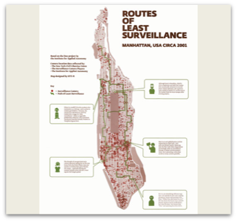
Institute for Applied Autonomy, “Routes of Least Surveillance,” 2001, An Atlas of Radical Cartography, 2007.
As their title suggests, the IAA mobilizes its mapping skills against authoritarian culture by documenting mass surveillance devices in place throughout Manhattan and charting routes that will avoid them. “In taking up the term 'tactical' in an arts context,” the collective declares, “we link cartography with 'tactical media' . . . [and] claim that ‘tactical cartography’ refers to the creation, distribution, and use of spatial data to intervene in systems of control affecting spatial meaning and practice” (“Tactical Cartographies,” n.p.). Like “Routes of Least Surveillance,” the projects below use digital media to intervene in “the rising intensity of authoritarian culture,” a culture of surveillance that permeates, structures, and controls everyday life on screen and off.
Vik Muniz’s “WWW” (2008) needs no provocative title to make its point succinctly:
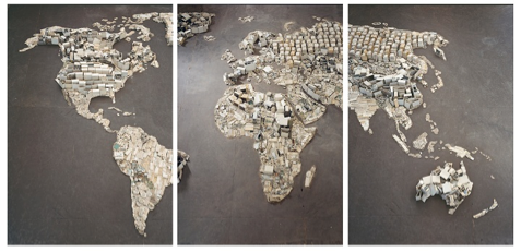
Vik Muniz, “WWW,” Pictures of Junk, Digital C-Print, Triptych (each panel 104 x 71 in.), 2008.
This basketball-court-sized world map is an installation piece that consists entirely of junked computer parts or, in more recent gallery exhibits, a photographed reproduction hung as an arresting triptych. Muniz’s work is an elegant rebuttal to the already clichéd (and pastoralizing) talk of cloud computing’s clean, green, digital environment and a powerful reminder that the poor in cities like Agbogbloshie, Ghana; Bengaluru, India; and Guiyu, China, bear the ecological consequences of the deluge of virtual garbage.
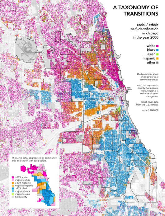
Like Muniz’s “Pictures of Junk,” Bill Rankin’s “Chicago Boundaries” asks us to consider the consequences of our cartographic techniques. Originally published as an essay in the Spring 2010 issue of the architecture journal Perspecta, it reappeared with interactive features on Rankin’s site Radical Cartography. Mouseover the map and official neighborhood demarcations appear in black lines over top Bunge’s map of ethnic and socioeconomic indicators of city residents. Rankin uses a technique called dot mapping, which produces a more nuanced depiction of both stark and gradual transitions within a map’s representation of population statistics. (“Chicago Boundaries” plots over 200,000 dots).
Maps showing race, ethnicity, class, and other social statistics are virtually always drawn in neatly arranged blocks of color, like the following legend of Chicago’s ethnic community:
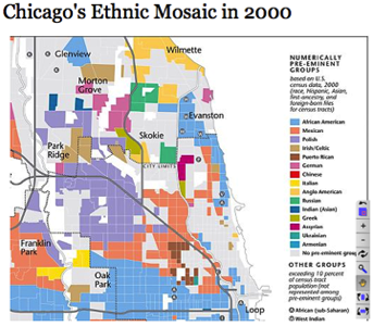
From The Encyclopedia of Chicago, Reproduced in Bill Rankin’s Radical Cartography, 2009.
“Maps like these make a strong visual argument,” Rankin explains. “They make it seem as though human beings are naturally divided into relatively homogenous groups separated by sharply defined boundaries…. By shading each [area according to] which group holds the majority, they visually reinforce political ideals of national self-determination and ethnic homogeneity.” Rankin’s dot map renders all the more acutely Chicago’s racial diversity and sharp segregation, while it also illustrates, for instance, the zones in which extreme wealth comingles with abject poverty. The areas marked in grey are also telling, as they show where gaps in infrastructure may be read along race and class lines. Ultimately, Rankin argues for a “borderless” cartography, by which he means a graphic representation of social statistics without the hard-edge lines of “community area” mapping. As communities change, so must maps. In this sense, a humanistic interpretive framework—one that courts complexity, multiplicity, and qualitative judgment—underscores Rankin’s innovative designs.
Bunge and the DGEI are perhaps the secret heroes of tactical mapping in a digital environment. The three examples that follow suggest some ways in which their formative experiments in social geography have influenced journalism and academic study. Each not only adds scientific precision to mapping but also assists our cognitive processing of dynamic events, actions, and energies plotted across distant terrains and extended timelines.
The first details a top secret NSA program called Boundless Informant, leaked by whistleblower Edward Snowden. Many of the maps contained within the Snowden Archive—in step with Bunge’s “Region of Rat-Bitten Babies” and “Where Commuters Run Over Black Children”—are readymade counter-maps, insofar as their interpretive force requires only a slight shift in frame from a small and secretive intelligence community to a global community of internet users. The slide below contains details regarding Boundless Informant, a powerful data-mining tool that seizes vast amounts of computer and phone records. The slide indicates a staggering 97 billion pieces of information collected from networks worldwide.
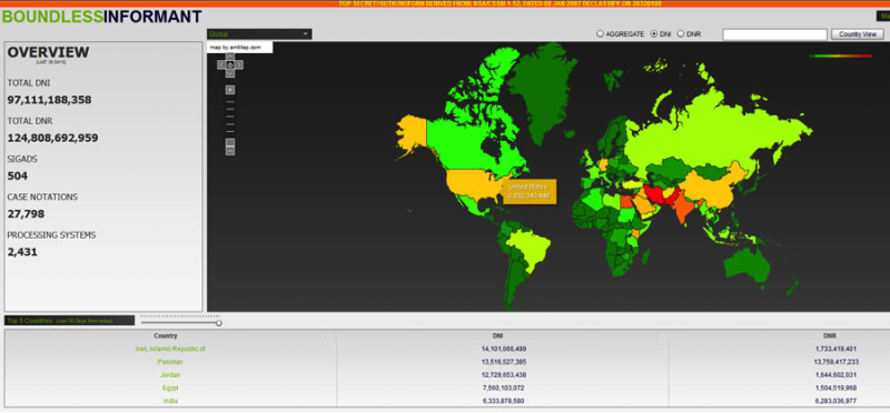
“Boundless Informant,” National Security Agency, The Guardian, June 11, 2013. Courtesy of Edward Snowden Archive.
Key to explaining NSA mass surveillance programs like Boundless Informant, XKeyscore, and Prism are visual aids like the use of color in this heat map, which shows countries least to most surveilled by the NSA as of 2007 (least –> green, yellow, orange, red <– most). Note, for instance, that while the US spied on Iran most often, second and third were Pakistan and Jordan—both supposed U.S. allies in the Arab World.
The second map, also from the Guardian, visualizes the Afghanistan War Logs released by WikiLeaks. Its creators observe that in order to read all 391,832 documents “at the rate of one document per minute, it would take 272 days non-stop to read every report—and you still might miss the big picture.” The interactive feature relies on data mining and GIS to plot complex layers of data in ways that highlight their narrative potential to tell stories about real people affected by war and occupation.
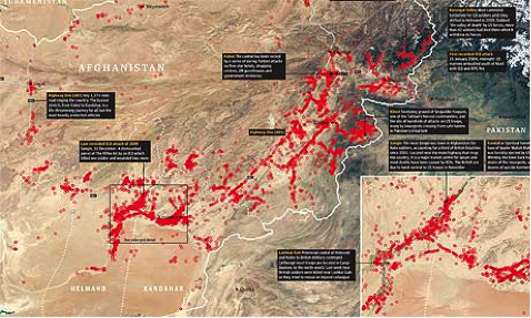
Afghan War Logs, Data Blog, The Guardian, Jul. 25 2010.
Like the cognitive maps we discuss in a future post, the Guardian’s adaptation of the WikiLeaks archive expresses what Lev Manovich in The Language of New Media explains is the reorientation of narrative according to the computer’s two principal forms: the “database” and “navigable space” (213-17). The first lives by a code of information access, storage, and indexation; the other values psychological immersion, navigation, and interaction. One report, for example, documents the death of at least 56 Afghan civilians in a botched raid on Taliban insurgents:
(FRIENDLY ACTION) CAS RPT (Bomb) KDZ JTAC, F-15S : 56 UE KIA
031542ZAUG09, OCC-P KDZ REPORTED 2X FUEL TRUCKS WERE STOLEN BY UNK NUMBER OF INS. INS INTENDED TO CROSS KDZ RIVER AT A FORD TO BRING THE FUEL TO CHAHAR DARREH DISTRICT. AT 1730Z, PRT KDZ JTAC OBSERVED KDZ RIVER AND REPORTED THAT IT DISCOVERED THE TRUCKS AS WELL AS UP TO 70X INS AT 42SVF8903852017, ON THE FORD ON THE RIVER. THE TRUCKS WERE STUCK IN THE MUD. COM PERT KDZ LINKED UP WITH JTAC AND, AFTER ENSURING THAT NO CIVILIANS WERE IN THE VICINITY, COM PRT KDZ AUTHORIZED AN AIRSTRIKE. AT 2119Z, AN F-15 DROPPED 2X GBU 38 BOMBS. AT 2158Z, BDA CONDUCTED BY F-15/ROVER WAS THAT 56X INS KIA (CONFIRMED) AND 14X INS FLEEING IN NE DIRECTION. THE 2X FUEL TRUCKS WERE ALSO DESTROYED.
UPDATE:
041134D: 100X ANP WERE ON SCENE READY TO LINK UP WITH PRO COY AT PRT TO INVESTIGATE SCENE.
1213D: PRO COY STARTED TO MARCH TO AREA OF AIRSTRIKE AND ARRIVED ON SCENE AT 1234D. COY REPORTED THAT THEY HAD STARTED THEIR INVESTIGATION AND THAT THERE WERE A LOT OF ANA AND ANP AT THE AREA OF THE AIRSTRIKE.
1309D: PRO COY WAS ATTACKED WITH SAF FROM WESTERN DIRECTION. PRO COY RETURNED FIRE WITH SA. ENEMY FIRE STOPPED, SO COY CONTINUED WITH THEIR INVESTIGATION. AT 1322D, THE INVESTIGATION WAS COMPLETED. MEANWHILE, A LUNA (UAV) DISCOVERED SEVERAL PICKUPS AND PERSONS IN RAHMAT BAY (VF 879 523), SO PRT KDZ FIRED 2X 120MM ILLUMINATION MORTAR ROUNDS IN THEIR DIRECTION AT 1327D, TO PREVENT FURTHER ACTIVITIES OF POSSIBLE INS.
1353D: PRO COY MOVED BACK TO PRT KDZ AND ARRIVED AT 1423D.
UPDATE 041120D*
At 0900 hrs International Media reported that US airstrike had killed 60 civilians in Kunduz. The media are reporting that Taliban did steal the trucks and had invited civilians in the area to take fuel.
ISAF HQ commenced CIVCAS procedures and conducted a brief over VTC with COMD RC-N.
Mitigation proceudres have commenced and liaison with GIRoA officials in KABUL and in KUNDUZ are a priority.
The Governor of KUNDUZ is commenting that most of the casualties were Taliban.
RC-N and PRT KDZ are gathering more facts.
UPDATE 1314D*
041134D* ANP was with 100 policemen on scene and prepared to link up with PROTECTION COY (PRO COY), which will leave PRT for investigations ASAP. 041213D* PRO COY started march to area of air strike for investigation. 041218D* PRO COY arrived at HAJI SAKI DED BY (VF 903 526). 041234D* PRO COY was at (VF 888 522) reported about a lot of ANP and ANA at the area of the air strike. PRO COY starts with investigation. NFI.
UPDATE
041353D* PRO COY moves back to PRT KDZ.
041423D* PRO COY back at PRT KDZ.
Investigations ongoing.
NFI.56 Killed None(None) Insurgent
If the data points marked in red afford a startling wide-lens view of the war’s casualty rates, these logs override the pervasive military jargon to give each death a narrative intimacy.
Finally, the third example is a digital still from “Welcome to the Anthropocene,” a three-minute video summarizing 250 years of fossil fuel production’s impact on climate change. Owen Gaffney and Félix Pharand-Deschênes employ digital film, advanced animation, and data culled from OpenStreetMap, NaturalEarthData, and NASA in order to track climate change from the beginning of the industrial revolution, through the post-1950 acceleration of global capital, and onto present day crises.
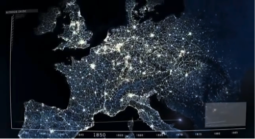
Owen Gaffney and Félix Pharand-Deschênes, “Welcome to the Anthropocene,” Welcome to the Anthropocene, 2012.
The viewer encounters the earth turning, over which a timeline chart measures economic growth; the planet is gradually covered over in webs of radiant light representing energy harnessed to power industry, transportation, food production, and entertainment. And with this growth: rising temperatures, unprecedented gas emissions, sinking deltas, ozone erosion, ocean acidification, and shrinking biodiversity threaten the natural planetary cycles on which humanity depends.
Tactical mapping’s fruitful syntheses of technological innovation and humanistic inquiry has the potential to allow us to map migratory populations displaced by war or climate change, a bank’s collateralized debt obligations and offshore tax havens, or the part of the human genome currently bound up in patent protections. In the next commentary, we will meet the photographer and social geographer Trevor Paglen, whose counter-maps assess a different problem. For, what do you do if the thing you intend to map—torture and rendition sites, for instance—the authorities claim do not exist.
Works Cited:
Critical Art Ensemble. “Tactical Media.” Critical Art Ensemble. Web. 4 Mar. 2015.
de Certeau, Michel. The Practice of Everyday Life. Trans. Steven Rendall. Berkeley: U of California P, 1984.
Institute for Applied Autonomy. “Tactical Cartographies.” An Atlas of Radical Cartography. Web. 5 Mar. 2015.
Manovich, Lev. The Language of New Media. Cambridge, MA: MIT P, 2001.
Mogel, Lize and Alexis Bhagat, eds. An Atlas of Radical Cartography. Los Angeles: Journal of Aesthetics & Protest Press, 2007. Print.
Raley, Rita. Tactical Media. Electronic Mediations 28. Minneapolis, MN: U of Minnesota P, 2009. Print.
Counter map collection