book arts

Defaced/refaced books

The erasure practices of Jen Bervin and Mary Ruefle

At the 2013 Associated Writers and Writing Programs Conference in Boston, I wandered among rows of bright, strange, and intriguing books piled high on independent poetry press tables. Hand-stamped, letter-pressed, spray-painted, ripped, sewn, and covered in tinfoil; poems shaped like boxes, poems printed on records, poems made into pop-ups or puzzles, or rolled as cigarettes — I even spotted a tiny book hidden inside a plastic egg.
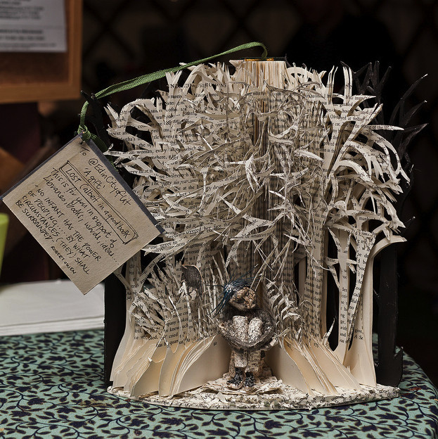
The artist's book, informed

Conceptual approaches in the handmade artist's book

Tony White -- Pickled Books
Two jars from Tony White's pickled books (1992)

My last post explored book artists who work conceptually using print-on-demand technology, but the use of conceptual methodologies extends to those who work in hand-made books as well.

This summer and fall, I have spent time in special collections at the University of Washington (partly in preparation for the Affect and Audience in the Digital Age symposium, and partly to find books for my spring workshop).

Jen Bervin

Sewing down the Mississippi

Jen Bervin will sew the Mississippi on your ceiling, if your ceiling is big enough.  I saw Bervin present on her “Mississippi” project. “Mississippi” is a panoramic scale model of the river that divides east and west in the United States. The scale is one inch to one mile, and the length of the river and gulf measures 230 curvilinear feet. The river is installed on the ceiling; it shows the riverbed mapped from the geocentric perspective, from inside the earth's interior looking up at the riverbed. It is composed of silver sequins; light shifts over the surface of them as you move through the space.  The sequins are made of foil stamped on cloth, a rare variety of vintage French sequin that comes strung in clusters. They vary in circumference — some are quite tiny. They are sewn onto a very simple layer of paper, mull, and tyvek. The lower Mississippi, or meander belt, was completed at The Josef and Anni Albers Foundation in August 2009. “During that time,” Bervin writes, “I found that it took me exactly the same amount of time to sew the length of river in sequins that it would have taken me to walk the same section of the river.” 

The artist's book as idea

Book artists who print on demand

Travis Shaffer Reworded
Travis Shaffer, Reworded (Self-Published, Print-on-demand book, BLURB, 2013). Image: Travis Shaffer

My last commentary began by asking what a print-on-demand artist's book might look like and explored works of conceptual writing that use the trade paperback form as a central aspect of their poetics.

I'd like to ask the question again, and offer a somewhat different print-on-demand approach:

So what might a conceptual, print-on-demand artist's book look like?

It might resemble Travis Shaffer's work.

DiPalma reads from 'Further Apocrypha'

This is a four-minute excerpt from a reading given by Ray DiPalma at the Kelly Writers House on April 2, 2012. The full recording is available here: [VIDEO].  An audio recording of the reading (segmented by poem) is also available at PennSound.  In this excerpt he reads several sections from a book called Further Apocrypha, which was published in a strictly limited edition by Pie in the Sky Press. It is one of the most beautiful books I have seen (I saw it only briefly when DiPalma visited KWH last year). To see photographs of the book, go here. The YouTube excerpt was edited for PennSound by Allison Harris.

From the voice to the book

Jerome Rothenberg, 2010 Threads Talk Series presentation

LISTEN TO THE SHOW

Jerome Rothenberg on May 7, 2010, presenting at the Threads Talk Series (curated by Steve Clay and Kyle Schlesinger), mapped branches of book culture that are typically kept apart. Rothenberg reviews the differences between — and the need to bring together — speech and writing and printing, and he uses this summary as a way of freshly re-defining ethnopoetics.  The title of the talk from which this podcast-length (18 mins.) excerpt is taken: “From the Voice to the Book, from the Book to the Voice: a Dialectic.”

Facsimile again

Pt. 1

In the last decade or so, the proliferation of digital technologies has created an unprecedented interest in the art of the book, its history and culture, what William Everson called ‘the book as icon,’ and yet I’m not entirely convinced that people are reading more in the poetic sense of the word, that is, more deeply, broadly, tactfully, consciously, skeptically—dare I say imaginatively?

Small Fires Press

Friedrich Kerksieck established Small Fires Press after meeting Walter Hamady in 2004. With a handful of titles to his credit, he enrolled in the esteemed MFA in Book Arts Program at the University of Alabama, where he studied with Steve Miller. Being an entirely self-taught printer, I’ve always been a little bit jealous of those who have had the opportunity to learn the finer points of typography and printing from Miller, who in turn, learned from Hamady when he was a student in Wisconsin in the 1970s. Hamady, in turn, was inspired by (but never formally studied with) Harry Duncan of The Cummington Press. Suddenly, the roots and branches of the family tree become more pronounced. Although each of these artists and their presses are, of course, distinct, there is a family resemblance worth noting. Compare Wallace Stevens’ Esthétique du Mal published by Cummington in 1945 to Scott Pierce’s Some Bridges Migrate published by Small Fires in 2008, and you’ll see what I mean. However, in book arts, it’s critical to note the importance of the distinction between resemblance and imitation. For example, there’s a whole lot of Perishable Press knockoffs floating around that aspire to Hamady’s mastery and originality through mere imitation that, unfortunately, culminate in an absurd collection of literary tropes and cute, but meaningless, artsy gimmicks. Resemblance has more to do with a history of ideas, the integrity of the imagination, and respect for the construction of things.

Poems & Pictures now

The focus of the Poems & Pictures exhibition I curated in 2010 for the Center for Book Arts in New York City was primarily on collaborations between visual artists and poets, primarily in book form, between 1946 and 1981. I fondly refer to these thirty-five years as a ‘renaissance’ in the art of collaboration, a rich period of revitalization that was often made possible by adventurous publishers who, in various ways, made such collaborations and ways of exploring and complicating the relationship between word and image possible. The history of the book often sidesteps art history and criticism, while a close examination of the work itself tells another story, its own story, distinct, but not dissociated from other artistic and literary traditions. In these years, arguably for the first time, Americans created the first books that broke from the principles of European book design, while rivaling the experimental works of the Dadists, Futurists, and Surrealists of the early decades of the twentieth century. Some of the books included in this exhibition were: Joe Brainard’s C Comics; Wallace Berman’s Semina; Robert Duncan & Jess’ Caesar’s Gate; Tom Raworth & Jim Dine’s Big Green Day; Larry Eigner & Harry Callahan’s On My Eyes, Kenneth Patchen’s Panels for the Walls of Heaven; Ted Greenwald & Richard Bosman’s Exit the Face; Charles Bernstein & Susan Bee’s The Occurrence of Tune; Bill Berkson & Philip Guston’s Enigma Variations; Joanne Kyger & Gordon Baldwin’s Trip Out & Fall Back; and various collaborations between Ron Padgett & George Schneeman. And a whole lot more.

Book sculpture

This was made of a book. To see many more such objects, go here.

Syndicate content