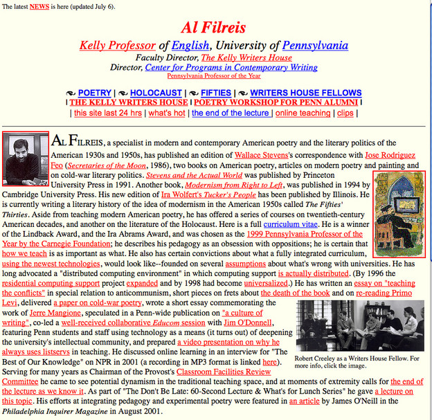
Lament for My Late Page

I loved my old home page and I was sorry to have to give it up a few years ago for something spare and linky/listy. I concede that the sparer style works better but I miss the narrative clutter, a non-design enthralled by hyperlinking right there in the flow of words. That little "latest news" link in the top left blinked for about a year when that was the newest thing. Fortunately I knew that blinking links were bad news pretty quickly and reverted to plain old plain old as soon as the excitement faded. The old page dates back to 1994 and it looked more or less as you see above from 1994 until 2007 or '08! I maintain a link to it and I imagine that most of the links still work. Prior to the site on top of which this old page sat I had a wonderful gopher. This was of course before the graphical browser (Mosaic was the first, I think--before Netscape) and it was stiff and hierarchical but effective in conveying information and giving users a tour, in effect, of the material you wanted to present. I loved the chaos of hyperlinking once it was possible through this thing called "the world wide web" and, let me repeat, I felt that the hyperlinky text was the way to go. Eventually another kind of design became the standard. Now--what with drupal and blogs and blog-style user-enabled sites--we're back to a more cluttered surface, but still nothing like this single-look languagy flat surface.