The POD people
Writing through, erasure, appropriation, mimicry
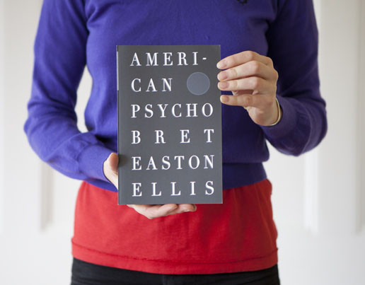
So what might a conceptual, print-on-demand artist's book look like?
Several contemporary writers are using the form of pre-existing books as a container for innovative publishing experiments that they can make available at a reasonable price thanks to POD and affordable printing options. Like the pod people in Invasion of the Body Snatchers, these new books resemble their sources externally, but diverge dramatically in content, which involves erasure and writing-through. They are also facilitated by the availability of digital editions of these books which provide a searchable, scrapable, alterable source.
The following are not all print-on-demand publications, but they take on trade paperback form in ways that intrigue me:
American Psycho by Mimi Cabell and Jason Huff (Vienna: Traumawien, 2012)
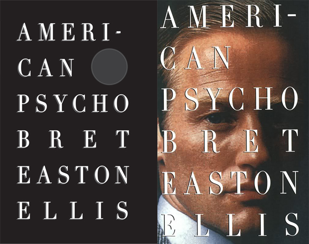
Cabell and Huff emailed Bret Easton Ellis's American Psycho back and forth one page at a time through Gmail, collecting the relational advertisements Google displayed for them. They then published their own American Psycho with these advertisements inserted as footnotes and the text itself (save chapter titles) erased. The fascinating result of their experiment nods to Ellis's book in its design, mimicking the typography and layout of the 1991 Vintage Contemporaries First Edition. Their cover replicates that paperback's, but sets the book's title against a funereal black background instead of the tan skin and blond coiffed gentleman on the original's cover, a choice that reflects the obliteration of protagonist Patrick Bateman's narrative within, as he is subsumed by the products and advertisements that consume him. The project also, they note, "reveals GMail’s unpredictable insensitivity to violence, racism, and sex."
In Cabell's words:
We were most curious how Google would handle the violence, racism and graphic language in American Psycho. In some instances the ads related to the content of the email, in others they were completely irrelevant, either out of time or out of place. In one scene, where first a dog and then a man are brutally murdered with a knife, Google supplied ample ads regarding knives and knife sharpeners. In another scene the ads disappeared altogether when the narrator makes a racial slur. Google's choice and use of standard ads unrelated to the content next to which they appeared offered an alternate window into how Google ads function.
![]()
My copy, purchased from the authors this summer, has a slightly different cover from that depicted at both Cabell's and Traumawien's site, substituting a footnote that leads to Cabell and Huff's names writ small at the bottom the cover for Ellis's name. This is in part due to the restrictions of the bookseller whose Espresso Book Machine they used to print several copies before traveling abroad.
The book's contents are available as a PDF at Traumawien's site. The publisher's mission directly addresses the role of books in the digital age:
TRAUMAWIEN considers the paradox of transferring late-breaking digital aesthetics into book form, as new media narrative snapshots of literary genres otherwise quickly lost in the immense output produced by web every second.
Huff has done other work in book form, producing a limited-edition project that runs Robert Frost's "Road Not Taken" through Google's auto-complete, and a collection of Microsoft Word auto-summarizations of Project Gutenberg's 100 most-downloaded e-books that can be printed on demand on McNally Jackson Bookstore's Espresso Book Machine.
See more of their work at both artists' sites.
Pigeon Reader by Simon Morris (Information As Material, 2012)
Information As Material (also known by its witty acronym, iam), a publishing project of Simon Morris and Nick Thurston, has put out a number of books that draw on the reader's familiarity with paperback editions of specific books, including Thurston's Historia Abscondida, which mimics Nietzche's Gay Scienceand processes the text through its index, and Morris's Getting Inside Jack Kerouac's Head, a reverse-order retyping of Kerouac's On the Road that originated in blog form (hence the need to publish back to front, since the most recent content of a blog always appears at the top), which takes its design cues from the 2007 Penguin edition (which I learned from this handy archive of Kerouac covers) and substitutes Thurston and Morris for Neal Cassady and Kerouac.

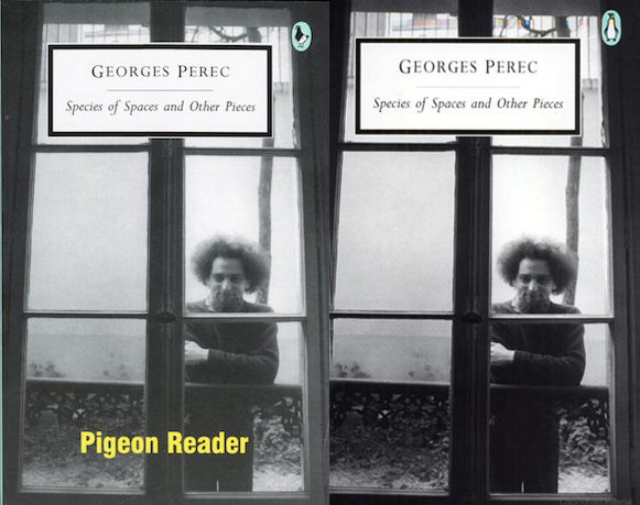
Morris has said he intends readers of this book to have the kind of reaction Ed Ruscha hoped for with his bookworks, "a kind of huh" moment, which an unsuspecting shopper might indeed experience faced with what appears to be a reprint of Perec's collection. The reader discovers half-way through, however, that the work has been doctored. Inspired by the claim in Perec's central piece, "Reading: A Socio-physiological Outline," that the act of reading is like "a pigeon pecking at the ground in search of breadcrumbs," Morris gave the story to 12 pigeons (1 per page), and had them "read" this work, photographing their peckings and inserting the images into the center of the book in its place. At the close of 12 pages, the book continues as usual. The reproduced book thus serves as a container for this animating project.
Subtle clues throughout indicate the way Morris is playing with the conventions of paperback publishing, from replacing the penguin with a pigeon, to the advertisements for other iam titles at the back of the book. Craig Dworkin and Christian Bök's anagrammatic blurbs on the back cover nod subtly to Oulipo, and perhaps reflect another act of pecking, with Bök sorting through letters to re-assemble Dworkin's text.
Darkness, by Yedda Morrison (Los Angeles: Make Now Press, 2012)
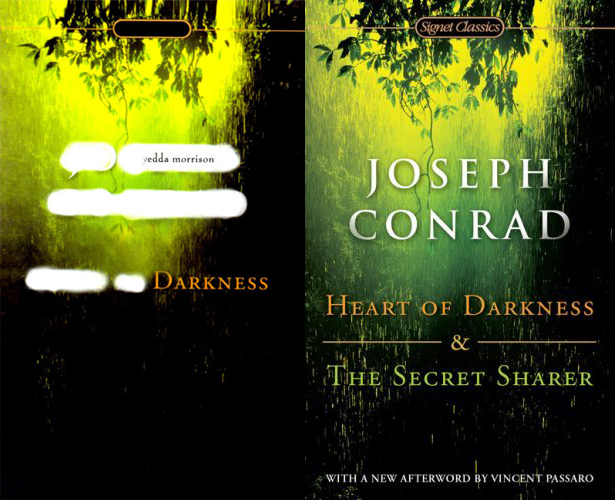
Morrison has erased much of Joseph Conrad's Heart of Darkness, leaving behind, as she claims, "only references to the natural world." Her selections raise questions about colonial occupation, exoticism and othering, and the very definition of what is and isn't "natural." On many pages, the language shimmers. The book operates a bit like an elliptical landscape, while also suggesting the limits of linguistic representation, the places where language itself goes dark. A posthuman project, the book's design directly references its source, asking to be read with Conrad's novella, and self-consciously blacking-out The Secret Sharer, with which it is paired in the Signet Edition on which it is modeled.
Conrad's work has proven interesting to other writers who have chosen not to emulate specific editions.
In 2010, Publication Studio issued Dan Gilsdorf's erasure of Heart of Darkness, which leaves behind only the text's punctuation. Thanks to Nick Montfort for sharing this text.
Book artist Sarah Jacobs has been erasing her way through Conrad's work for some time, publishing fascinating interventions into his texts through her Colebrooke Editions. These perfect-bound artist's books are sold reasonably through her own website and select vendors in the UK, including London's bookart bookshop, where I picked up Luxuriant Beauty Bears Witness: We Are Not Barbarians, an erasure from Nostromo that in its insistence leaves behind negations (hence "we are not"). The constellated pages contain surprising affirmations and moments of discovery, where "luminous" words are allowed in because of their spelling—they contain "no." The first two pages:
"never / no / not visible / not soil enough / no / nothing / enough / no other sign / never seen / cannot tear / now / renounced / never / known"
"another / no / snow / snows / now now / not find / not defeated / no / no"
The Sun Also Also Rises, by Rob Fitterman (Calgary: No Press, 2008)
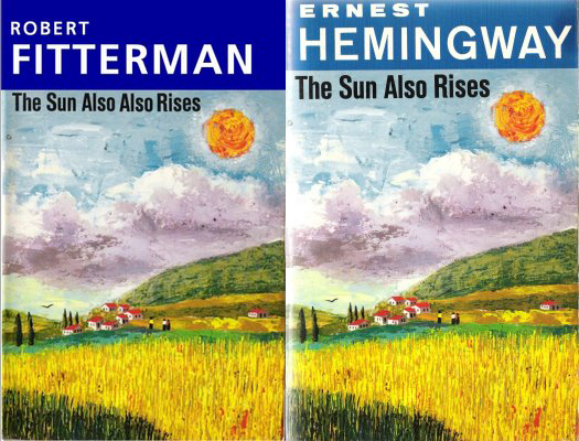
I was first introduced to Fitterman's writing-through of Hemingway through Genevieve Kaplan's wonderful blog The Forest and the Trees, which tracks erasure works and altered books. An erasure that leaves behind only phrases beginning with "I" in Hemingway's text, The Sun Also Rises was published by Derek Beaulieu's No Press alongside two other interventions into Hemingway, Fitterman's My Sun Also Rises, which he describes as "a parallel companion to the The Sun Also Also Rises which translates my erased version of the Hemingway original into my own experience of moving to downtown Manhattan in 1981," and Nayland Blake's Also Also Also Rises the Sun, his own erasure of Hemingway. Currently sold out, the set was sold for $25. The text of Fitterman's two Hemingway works is available at his website as A Hemingway Reader.
Selected Further Reading:
Most readers will be familiar with artist Richard Prince's appropriation of The Catcher In the Rye, which he published in 2011, substituting his own name for J.D. Salinger's and raising the book's price tag. Kenneth Goldsmith has written on it for Harriet (the source of the image below), and Prince discussed it in an interview with Kim Gordon last year.
Simon Morris gave a thoughtful exegesis of his publishing practice at UPenn earlier this year titled "Eating The Book," which you can stream online.
Sina Queyras interviews Derek Beaulieu about No Press on Lemonhound.
Also see the following commentaries at this site:
Artists' books in the age of digital publishing