
Historically, the content of a text has generally been considered as having a separate existence from its physical manifestation as print. Western Literature was originally oral, and though later committed to written form, the spoken word — the conditions of its utterance (or performance) — was long thought to precede, or to lie outside the parameters of, the physical text. This regard for the text as a convenient repository was reinforced by the traditions of dramatic and public speech.
In the East, where wood-block printing preceded moveable type printing (in Europe) by several hundred years, there nevertheless developed a different tradition involving elaborations of calligraphic expression and design. Europe also had a calligraphic tradition, though it was primarily restricted to the evolution of the Roman alphabet, and was geometrical in its spirit and character. In the East, calligraphic characters were invented to express meanings through shapes and styles of design, which encouraged the elaboration of techniques, sometimes associated with, or related to, painting, and a tradition of poetic expression going back hundreds of years, in which the meaning of a literary work was both signified, and visually expressed by the brush (calligraphic) medium, either as an integral accompaniment to works of art, or through the expressive definition and shape of the characters themselves. There is no true counterpart in Western Tradition, to the various Eastern calligraphic traditions of China, Korea, and Japan, which were unknown, for the most part, in the West, until the latter half of the nineteenth century.
Printing from moveable type had a revolutionary effect on the production of literature, as it is credited with facilitating the spread of knowledge during the Renaissance, and of the Enlightenment in Europe. The enormous power of this mechanism tended to suppress the relationship between the means of text-generation and the artisan-writer, a division which continues right into the twenty-first century. This lack of a coherent tradition of calligraphic expression in the West, which contributed to a systematic alienation of the writer from the material text, fostered a skeptical regard for the visual possibilities and potentials of a literature based on the eye and the hand, instead of the mere conveniences of mechanized typographic generation.
The trend towards mechanization was accelerated during the Industrial Revolution, with increasingly sophisticated and efficient techniques of automated reproduction. A series of typographic machine inventions, beginning in the nineteenth century — including the linotype machine, rotary press, offset press, and the manual typewriter — transformed the traditional typeset model, driving the proliferation of print mass media throughout the twentieth century. Isolated exceptions to this historical trend would include William Blake (1757–1827), painter, engraver and poet extraordinaire — whose work has clear antecedents in the documents of medieval scribes — and his illuminated “visionary” manuscripts — integrating both custom inscription and illustration — are a direct attempt to resuscitate or restore a tradition effectively driven underground by the ubiquity of moveable print technology; and in America, where Walt Whitman (1819–1892) — who had worked as a typesetter early in his career — paid for, designed, and did much of the typesetting for the first edition of his Leaves of Grass (1855). Both the concept and feel of this original edition suggest that Whitman was attempting to unite the qualities of the material text, as an embodiment of visual and tactile object, with the rustic, nativist thematic content of his ambitious American poem sequence.
*
It was not until the invention of the manual typewriter — which may be seen, in an historical timeline of increasing elaboration of type technology (printing), as an intermediate step in the development of expression through mechanical textual means (media) — that efficient production of the print text was first made possible directly by the individual user, not depending upon any intermediate step for realization, freeing the writer/artisan from a dependence upon the printing press — permitting, in effect, a rapid setting of text, and an opportunity to express meaning through a medium controlled by the artisan/writer.
The manual typewriter, in the form that we now know it, was invented in 1867. It used the so-called “QWERTY” layout of keyboard letters (in English), which has remained standard through to the present day with personal computer keyboards. By 1910, after some minor mechanical adjustments, the manual typewriter achieved a standardized design. The dimensions of the paper — the familiar 8.5 x 11 “letter size” (as a field or visual surface) — is also a standard that is linked historically to the development of the typewriter.
Traditional typefaces were designed to set type with variable “proportionate” widths. Since mechanical typewriters could not “justify” type (that is, adjust the incremental movement of the platen carriage to accommodate the differing widths of the individual letters), monospaced typefaces were invented. The invention of the typewriter, with its equivalently spaced letters, created a two-dimensional grid of the paper field, consisting of the spacing between the individual horizontal lines of type, and the vertical equivalent spacing of the letters. Thus, the component materials for the personal typographic text were established and in place well before Eigner assumed their use in the 1940s.
Though originally invented to facilitate rapid and efficient recordation of physical text, the typewriter eventually supplanted handwriting for many kinds of writing, both technical and creative. Traditional typesetting techniques, as well as page and book design, both played a significant role in the assumptions and clichés regarding the formatting of prose, line length, paragraph dimensions, indents, justification, and so forth. The mechanical manual typewriter, however, despite its nearly universal use for nearly a hundred years, was largely ignored as a device with an inherent potential for creative expression. Typographic and book design styles and traditions were determined by the commercial publishing industry, which was in turn based upon pre-industrial, and later, industrial applications or adaptations of classic typesetting practice, and book binding. It has been commonly thought that the personal typewriter’s predominant characteristic, its equivalent spacing, and equivalently spaced type font(s), represented an inconvenient limitation, which could perhaps serve as an intermediate step in the generation of text (from which typesetters and composers made a finished product) — a necessary evil or unfortunate consequence of the limitation of the typewriter’s mechanical design. History would have to wait until the invention of the personal computer — with its automated justification programs — to liberate artists and writers from the typewriter’s dominant inter-position, as the sole alternative to either script or voice recording, to produce their art.
Early modern departures from the traditional presentation of distributed text formalities would include such deliberate examples as Mallarmé’s Un Coup de Des, or Apollinaire’s Calligrammes. In the fields of advertising and graphic display, of course, countless innovations took place, but these were primarily non-literary in origin, and visual in their intended effects. Meanwhile, the typewriter became the common medium across the spectrum of users, for composing, and fixing, written texts. For the first time in history, creative writers made their own textual versions directly in print form. It was inevitable, given this fact, that the new mechanical medium would influence the work of artisan-poets in the modern age. William Carlos Williams, Ezra Pound, Marianne Moore, and — most particularly — E. E. Cummings (each a major Modernist innovator), were all influenced or inspired by the typewriter’s facility to arrange, modify, and express visual and aural effects directly on the page. It doesn’t take much imagination to appreciate the precisionist’s delight in lines like these, of Marianne Moore’s, constructed out of the most arbitrary of syllabic structures —
The Fish
wade
through black jade.
Of the crow-blue mussel-shells, one keeps
adjusting the ash-heaps;
opening and shutting itself like
an
injured fan.
The barnacles which encrust the side
of the wave, cannot hide
there for the submerged shafts of the
sun,
split like spun
glass[1]
— and so on, without also acknowledging that its mathematical efficiency derives from an acute sensitivity to the strict increments which form the basis of its measure, a count not just of its syllables, but of its vertical indents and the visual tensions of its line-breaks — all qualities which suggest a mechanical appreciation of nature and form. From Pound’s perspective, the inclusion of Chinese characters directly into the body of his texts (in The Cantos) implied a coincident respect for the symbolic evidence of original meanings, embodied in their original form(s). To Williams, the poem was dynamic and gesticular, his stepped movements dramatic demonstrations of purpose —
Sunday in the Park
Outside
outside myself
there is a world,
he rumbled, subject to my incursions
— a world
(to me) at rest,
which I approach
concretely —
The scene’s the Park
upon the rock,
female to the city
— upon whose body Paterson instructs his thoughts
(concretely) …[2]
— which expresses a kinetic motion through the placement of words — nervous, impulsive, and shifting. Such innovations of the free use of shifting parameters and coordinates in verse, however, reach a kind of crescendo in E. E. Cummings’s various “typographical” “experiments” during the 1920s and after. Though it is not generally known or acknowledged, Cummings had always conceived of his poems in monotype face — his famous entanglements with traditional typesetters notwithstanding — and had striven to achieve a kind of mediated compromised version of his poems by tweaking his work into “linotype-ese”:
am fighting — forwarded and backed by a corps of loyal assistants — to retranslate 71 poems out of typewriter language into linotype-ese. This is not so easy as one might think;consider,if you dare,that whenever a typewriter “key” is “struck” the “carriage” moves a given amount and the “line” advances recklessly or individualistically. Then consider that the linotype(being a gadget)inflicts a preestablished whole — the type “line” — on every smallest part;so that the words,letters,punctuation marks &(most important of all)spaces-between-these various elements,awake to find themselves rearranged automatically “for the benefit of the community” as politicians say.[3]
As baffling as Cummings’s preferences regarding the appearance of his published pages may have seemed to his contemporaries, his insistence on the material realization of his original compositional methodology can now be seen within the context of a growing renewal of interest in the possibilities and potentialities of a closer relationship between author and medium, meaning and means. It’s easy to see how the setting of one of his typical poems — for instance, one such as his famous “Buffalo Bill”:
Buffalo Bill’s
defunct
who used to
ride a watersmooth-silver
stallion
and break onetwothreefourfive pigeonsjustlikethat
Jesus
he was a handsome man
and what i want to know is
how do you like your blueeyed boy
Mister Death[4]
— presented here in equivalently set Courier font — would depend upon the precision with which individual words and phrases were placed in relation to each other, on the grid of the page. Attempts to mediate traditional proportional typesetting procedure to accommodate such settings usually result in distortions of one kind or another. Though Cummings’s work would not be published in the manner in which it had originally been conceived, until the appearance of the ambitious Typewriter Edition of 1973, some eleven years after his death (London: The Marchim Press, Ltd., George Firmage, editor) — followed by the subsequent reissue of the original separate books of poems under the Liveright imprint “typescript” editions — the promise of his interest in the creative potentials of the typewriter was soon to be taken up by others in the intervening decades.
*
In his 1950 essay “Projective Verse,” Charles Olson had proposed the typewriter as a conscious creative element influencing the generation of literary text:
from the machine has come one gain not yet sufficiently observed or used, but which leads directly on toward projective verse and its consequences. It is the advantage of the typewriter that, due to its rigidity and its space precisions, it can, for a poet, indicate exactly the breath, the pauses, the suspensions even of syllables, the juxtapositions even of parts of phrases, which he intends. For the first time the poet has the stave and the bar a musician has had. For the first time he can, without the convention of rime and meter, record the listening he has done to his own speech and by that one act indicate how he would want any reader, silently or otherwise, to voice his work. It is time we picked the fruits of the experiments of Cummings, Pound, Williams, each of whom has, after his way, already used the machine as a scoring to his composing, as a script to its vocalization. It is now only a matter of the recognition of the conventions of composition by field for us to bring into being an open verse as formal as the closed, with all its traditional advantages.[5]
Despite Olson’s theoretical insistence on the typewriter as an accommodation of the writer’s desire to score texts for “performance,” his insistence on the importance of the typewriter as an instrument of composition did not carry that purpose over to the finished page in his own work. His dramatic, muscular, rhetorical verse is recorded on the page with a great variety of line lengths and arrangements, but in traditional proportional typefaces. In any event, by 1950 then, there had occurred a recognition of the crucial place the typewriter might play in creative composition, but aside from a handful of largely underappreciated experiments by Cummings (beginning in the 1920s), no serious poet had yet ventured into the visual/musical FIELD to explore what subtleties and effects might be achieved by using the equivalent grid to make poems radically set to their own specific measures and weights. In a statement Eigner made for publication in 1996, he said (in 1995):
Hindsight (experience) says people give meaning to the world by evaluating or emphasizing things strangely enough: I picked up from e. e. cummings that everything you do on the page matters. When you don’t have regular meter or rhyme, the slight pause provided by the line (/) or stanza (//) break, the turn from one verse to another, gives stress and emphasis. It seems that one thing may be given too much stress, sort of like getting too hung up, fanatic, about a thing, unable to continue until, say, you may lessen the stress by just having a line, instead of a stanza, break … It’s a course of thinking — unlike a piece of prose it can be very short or long, can stop anywhere or continue unexpectedly like a letter or a walk. But it’s different from either of these in that it has to have more coherence, more immediacy and force (I realized this before I saw Olson’s characterization ‘energy construct’).[6]
*
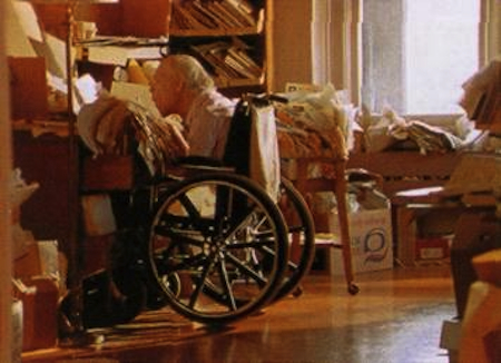
Larry Eigner’s career as a poet could not have happened were it not for the invention of the manual typewriter. Though he was capable of a crude kind of handwriting, this was neither rapid enough, nor controlled adequately to have permitted accurate composition. Larry learned to type as a teenager, though his ability was limited to the use of a single index finger and thumb. The agonizing pace of this procedure — slowly typing one letter (key) at a time — was a determinative factor in his approach to writing. Thus the typewriter both facilitated and limited his approach to composition, restricting his access to its typographic qualities, while ironically affording him his only entrée into print. Beginning in the late 1940s, with the help of his Mother, he was able to make fair copies of his work, and to write letters. Though physically isolated, by the time of his first literary contacts, with Cid Corman and Robert Creeley, he was enabled by the typewriter to reach out into the world at large. The typewriter was thus the key “prosthetic” link between Larry’s disabled body and the universe of print media, facilitating his participation in it, while gratifying his hunger for contact and intellectual discourse.
By the early 1950s, Eigner had begun to survey the territory first explored by earlier twentieth-century writers, marking out parameters of scoring and placement — of words and stanzas — and testing the limits of syntactical progression, of visual massing, which would become the hallmarks of his mature style. This style bore an obvious relationship to traditional Chinese painting, as well as to pictographic brushwork, through the deliberate organization of the spatial arrangement of individual words and stanzas, a technique whose effects would variously be referred to as “floating” or “hovering” or as resembling the movements of the dance or birds in flight. Such metaphoric descriptives, though, fail to take full account of the essential linguistic sophistication of his poetic experiments.
The specific combination of factors influencing Eigner’s approach to the page can be conflated: A) physical and social isolation for the first fifty years of his life, largely confined to the rooms in his parents’ house, his access to experience of the world circumscribed by limited opportunities for travel, movement, working in an enclosed porch; B) use of the typewriter to create texts, either as reflexive meditations, or as communications within a growing social and literary sphere. In retrospect, it may be seen that the adaptations forced upon him by these conditions would lead, ironically enough, to a fulfillment of Olson’s predictive composition by field technique, with its emphasis upon the typewriter as creative instrument, as well as upon the incremental unfolding of perceptions, whereby the poem becomes an open-ended extension into space and time, without arbitrary structural restraints or closures, beyond those imposed by the typewriter page. It is the coincidental nature of this “opportunity by limitation” which is perhaps the most revealing and gratifying aspect of Eigner’s accomplishments.
Though Eigner would initially be forced to acknowledge — as Cummings had before him — the predominance of traditional typesetting procedures, he lacked alternative means of composition, and thus continued throughout his life to create his typewriter texts in the same manner, unchanged. Given the limitations of his circumstance, it is unlikely that Eigner would ever have been in a position to dictate the terms of his appearances in print; nonetheless, when afforded the opportunity, he usually did his best to mediate between the precision of his original typescripts, and the proofs or galleys of printed pages of distributed type, just as Cummings had. The history of the publication of Eigner’s works, in magazines, books and broadsides is the record of the appropriation of his stylistic exactitude(s) to the limitations of traditional print text models.
In poring over Eigner’s voluminous manuscripts, and noting the extraordinary range of various traditional typographical “versions” of his poems undertaken over the years, it became apparent that to add to this list of adaptations would not do justice to the central meaning of his artistic effort and significance, and would in effect perpetuate the subtle but troubling distortions to which his work had been subjected during his lifetime. Eigner regarded the setting of his poems, within the exact equivalent dimensions afforded by the typewriter grid-field, as organizations of precise spatial relationships. As anyone who has ever attempted to mimic or duplicate the shifting relations of his words and stanzas on the page with distributed (variable) proportional typefaces knows only too well, this task is impossible: Following left-hand placements of first letters aligned with subsequent letter increments from above, or below, results in lines and words — especially in longer poems — radically rearranged. Such distortions are self-propagating; as each subsequent resetting of text takes place, there is progressively less fidelity to the original design. The basis, then, for any determination of the correct (intended) set of relationships, must be the original text. In order to present a valid “ur-text” or model upon which future use could be based, for posterity, it was decided to present the texts in equivalent typeface, just as Eigner had “set” them. It is possible, perhaps even useful, to imagine, that, like photographic negatives, these poems will be reimagined (printed) in other typefaces — distributed or proportional — over time. No writer can completely control how his or her work is reproduced in the future, but in order that the original designs and settings are not lost, the first responsibility to Eigner’s text, as to his present and future audiences, is to establish a reliable benchmark.
All decisions regarding typeface, composition and layout are aesthetic, though they may masquerade as practical requirements: legibility, size, density, and so forth. In the case of Eigner’s work, determined by the manual typewriter’s equivalent spacing, and the traditional letter-sized sheet, these are a priori frames, within which other problems must be mediated. Eigner’s text itself is, therefore, in every sense, an “image” of itself — or, in William Carlos Williams’s sense, “the thing itself” — opaque and obdurate. It is not a version of something, but the thing itself. That is both its beauty and its potential.
1. Marianne Moore, Collected Poems (1921; repr., New York: The Macmillan Company, 1951), “The Fish,” 37–38.
2. William Carlos Williams, Paterson, Book II (New York: New Directions, 1948), 43.
3. E. E. Cummings, The Selected Letters of E. E. Cummings, ed. F. W. Dupee and George Stade (New York: Harcourt, Brace & World, 1969).
4. Cummings, Poems 1905–1962, ed. George Firmage (London: The Marchim Press, 1973). Copyright 1923, 1951, © 1991 by the Trustees for the E. E. Cummings Trust. Copyright © 1976 by George James Firmage, from Complete Poems: 1904-1962 by E. E. Cummings, edited by George J. Firmage. Used by permission of Liveright Publishing Corporation. “Buffalo Bill” originally published in The Dial 1920.
5. Charles Olson, Projective Verse (New York: The Totem Press, 1959).
6. Larry Eigner, “EIGNER, Larry — ‘Larry Eigner comments,’” in Contemporary Poets, 6th ed. (New York: St. James Press, 1996), 303–305.