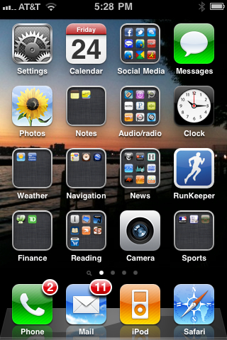
Group Together App Icons
And Find Yourself Less Rather Than More Organized
 I love the iPhone and use almost all the applications I've added to the thing. Sure, there are a few I got (mostly for free, but some I've purchased) but don't use. But the apps I use fill up a number of screens. And until recently I really didn't know how to organize them. Grouping them didn't quite work. I put the most-often used on the first screen but after that it's been a hodge podge. Then a new operating system for the iPhone came out, with a feature that enables you to slide a number of related apps into one generic icon; you can name the icon (e.g. "news" or "audio/radio"). This is much better but notice that the single-app icons are, well, iconic - visually memorable and distinct. But these new grouped categories are not visually distinct and I have a difficult time seeing them. At right is my first screen of apps on my phone. The clock (for setting my morning alarm) is really easy to see: it's a clock! My RunKeeper app (which I use every time I run) just really shouts: I'm a runner! But then there's "sports," "finance," "notes," "weather." Nothing distinct about them. So as it turns out it takes me just as long to find the apps, although they are neatly arranged and taxonomized, as it did before when they were all scattered about. This is perhaps not worth the complaint. But maybe among my blog's readers are Apple designers (actually I know there are): We need an upgrade of the operating system that will enable users to create the icon for the app groups. (By the way, I notice that this feature is not yet available for the iPad. I suspect this is so because the ugliness that results would look really ugly on the bigger device. I'm guessing that they're working on it.)